
Social Network Analysis Definition Social networks are simply networks of social interactions and personal relationships. Think about our group of friends and how we got to know them. Maybe we met them while ago from our schooling, or maybe we met them through a hobby or through our community. In fact, 72% of all Internet […]
Year: 2022

Python for Stock Market Analysis: Working with Moving Averages
Introduction This blog is a part of our series Python for Stock Market Analysis. Disclaimer: This blog is for educational purpose only and we do not recommend taking the knowledge gained from this blog to implement in real financial exercises. This blog tries to implement preliminary metrics that are used in the stock market analysis. […]

R Exercise: Training Different ML Models in R
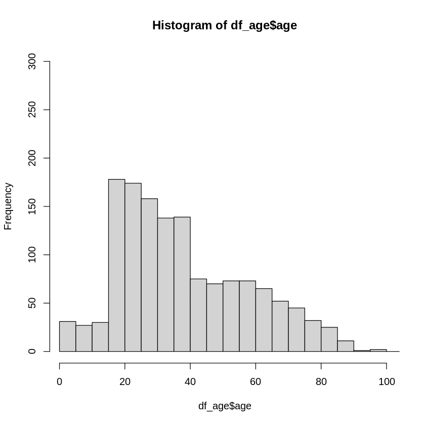
Load Data Dataset is available here. # Loading the data here library(haven) bank_loan_df <- read_sav("P4_bankloan_5000_clients.sav") bank_loan_df$defaulted_loan<-as.factor(bank_loan_df$defaulted_loan) bank_loan_df$education_level<-as.factor(bank_loan_df$education_level) str(bank_loan_df) ## tibble [5,000 x 9] (S3: tbl_df/tbl/data.frame) ## $ age : num [1:5000] 41 30 40 41 57 45 36 39 43 34 … ## ..- attr(*, “label”)= chr “Age in years” ## ..- attr(*, “format.spss”)= chr […]
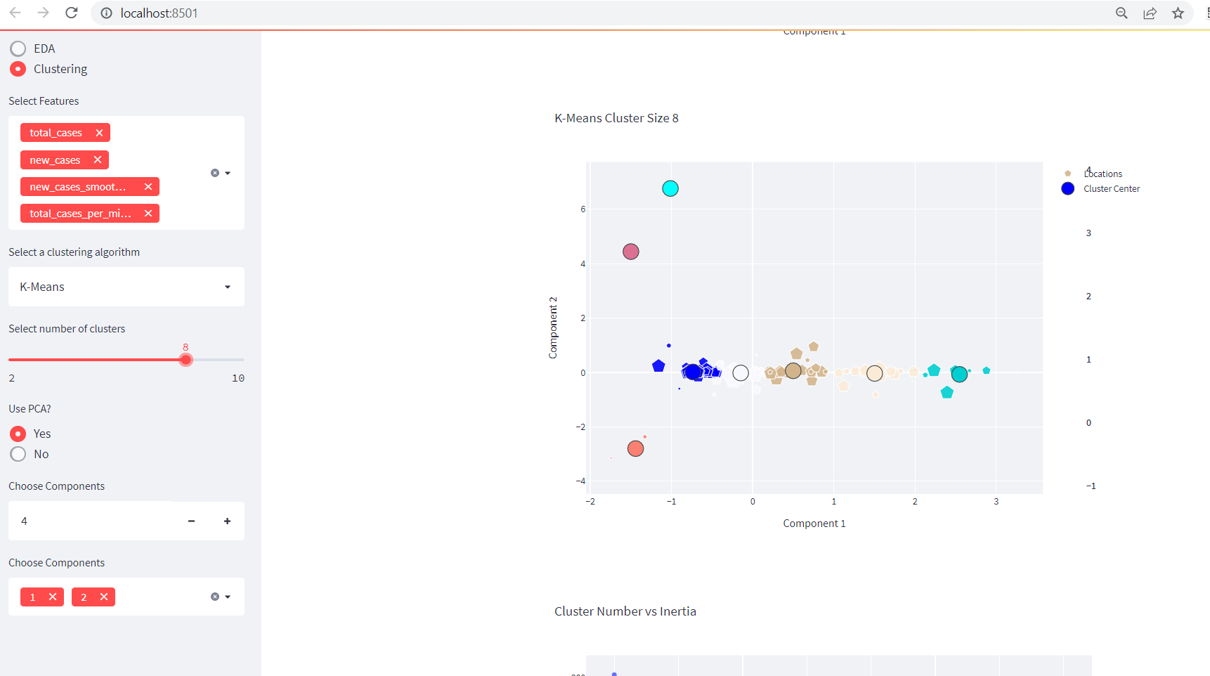
Creating Awesome Data Dashboard with Plotly in Streamlit: Clustering
This is a continuation of our previous blog entitled as Creating Data Dashboards With Streamlit and Python. Adding A Clustering Functionality Before diving into the clustering functionality in our existing app, please make sure you are following previous part. Or you can grab all the codes from below: import streamlit as st import numpy as […]
R Exercise: Working with PCA and Dimensionality Reduction
Check the data mtcars with head and save a new data as mtcars.subset after dropping two non-numeric (binary) variables for PCA analysis data <- mtcars head(data) ## mpg cyl disp hp drat wt qsec vs am gear carb ## Mazda RX4 21.0 6 160 110 3.90 2.620 16.46 0 1 4 4 ## Mazda RX4 […]
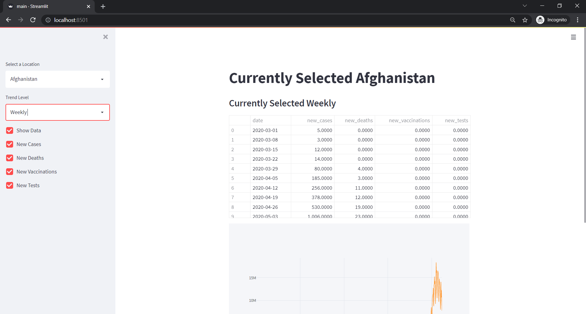
Creating Data Dashboard with Plotly in Streamlit
Data Dashboard are getting highly popular because the need to get insights from data is getting increased. One of the few ways we find the insights from the data is via dashboards. And for Data Analysts, there are options like tableau. But not all of them are for free. However, we can make some cool […]
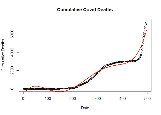
R Exercise: Working with Outliers and Fitting Different Machine Learning Models
Extract the Nepal COVID-19 data from Wikipedia to fit the following models with daily deaths as dependent variable and time as independent variable First plot the daily deaths by time and distribute the three outliers (added deaths around timeline of 400) before fitting the following models in the outlier adjusted data on training and testing […]
Installing Julia in Windows and Running in Jupyter Notebook
Installation of Julia First download the installer from official site then run the installer. Set the environvent path variable. Test it by opening the Julia Command Line or REPL (Read Eval Print Loop). println("hello world") Adding Julia into Jupyter First add package IJulia by typing use Pkg and then enter. Then Pkg.add("IJulia"). Wait for the […]
R Exercise: Working with Data from JSON API and Performing EDA
Import any data from JSON API Welcome to our data exploration journey! 🚀 In this exciting venture, we’re harnessing the power of data from the renowned source https://data.askbhunte.com/api/v1/covid. Our toolkit is all set, and we’re armed with two remarkable packages: jsonlite: This versatile gem brings JSON data and R data types together in a harmonious […]

Walkthrough of Statistical Analysis in Data Science
What is Statistical Analysis in Data Science? This blog starts from definition to explaining and experimenting with different part of statistics. Introduction Statistics is very important field and there are lots of definitions and use cases available and noting few. Statistics is a systematic collection of data on measurements or observations, often related to demographic […]