Creating Awesome Data Dashboard with Plotly in Streamlit: Clustering

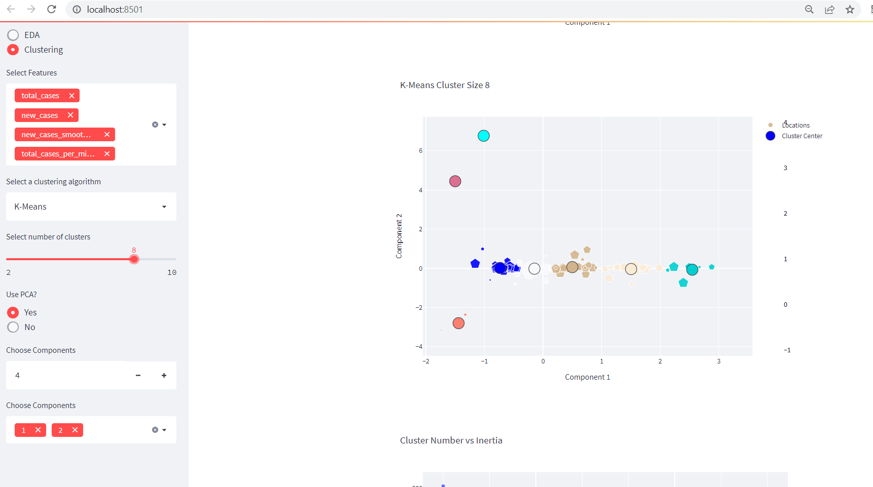
This is a continuation of our previous blog entitled as Creating Data Dashboards With Streamlit and Python. Adding A Clustering Functionality Before diving into the clustering functionality in our existing app, please make sure you are following previous part. Or you can grab all the codes from below: import streamlit as st import numpy as […]
Scroll to top
Subscribe to our Newsletter

Hello surfer, thank you for being here. We are as excited as you are to share what we know about data. Please subscribe to our newsletter for weekly data blogs and many more. If you’ve already done it, please close this popup.


No, thank you. I do not want.
100% secure.