Introduction
This blog is a part of our series Python for Stock Market Analysis.
Disclaimer: This blog is for educational purpose only and we do not recommend taking the knowledge gained from this blog to implement in real financial exercises.
This blog tries to implement preliminary metrics that are used in the stock market analysis. The dataset we will be using is available via yahoofinance.
For interactive version of this blog, please visit this link.
Preliminary Actions
Install Libraries
Please install:
- YahooFinance as
pip install yfinancefor downloading data of stock's history. - Pandas as
pip install pandasfor data analysis. - Plotly as
pip install plotlyfor interactive visualizations. - Cufflinks as
pip install cufflinksfor using interactive plots in pandas DataFrame.
You might need to install pip install -U kaleido if you need to save plots as png image.
If you are new into plotly, then we have an awesome blog about it where we have done plots based on COVID 19 dataset.
!pip install yfinanceRequirement already satisfied: yfinance in c:\programdata\anaconda3\lib\site-packages (0.1.63)
Requirement already satisfied: numpy>=1.15 in c:\users\dell\appdata\roaming\python\python38\site-packages (from yfinance) (1.19.5)
Requirement already satisfied: requests>=2.20 in c:\users\dell\appdata\roaming\python\python38\site-packages (from yfinance) (2.26.0)
Requirement already satisfied: multitasking>=0.0.7 in c:\programdata\anaconda3\lib\site-packages (from yfinance) (0.0.9)
Requirement already satisfied: pandas>=0.24 in c:\programdata\anaconda3\lib\site-packages (from yfinance) (1.2.4)
Requirement already satisfied: lxml>=4.5.1 in c:\programdata\anaconda3\lib\site-packages (from yfinance) (4.6.3)
Requirement already satisfied: pytz>=2017.3 in c:\programdata\anaconda3\lib\site-packages (from pandas>=0.24->yfinance) (2021.1)
Requirement already satisfied: python-dateutil>=2.7.3 in c:\programdata\anaconda3\lib\site-packages (from pandas>=0.24->yfinance) (2.8.1)
Requirement already satisfied: six>=1.5 in c:\programdata\anaconda3\lib\site-packages (from python-dateutil>=2.7.3->pandas>=0.24->yfinance) (1.15.0)
Requirement already satisfied: charset-normalizer~=2.0.0 in c:\users\dell\appdata\roaming\python\python38\site-packages (from requests>=2.20->yfinance) (2.0.7)
Requirement already satisfied: urllib3<1.27,>=1.21.1 in c:\programdata\anaconda3\lib\site-packages (from requests>=2.20->yfinance) (1.26.4)
Requirement already satisfied: certifi>=2017.4.17 in c:\programdata\anaconda3\lib\site-packages (from requests>=2.20->yfinance) (2020.12.5)
Requirement already satisfied: idna<4,>=2.5 in c:\programdata\anaconda3\lib\site-packages (from requests>=2.20->yfinance) (2.10)Import Required Libraries
import pandas as pd
import plotly.express as px
import cufflinks
import plotly.io as pio
import yfinance as yf
cufflinks.go_offline()
cufflinks.set_config_file(world_readable=True, theme='pearl')
pio.renderers.default = "notebook" # should change by looking into pio.renderers

pd.options.display.max_columns = None
Download Stock Data of Apple
By default, we are allowed to download data from 1900-01-01
symbols = ["AAPL"]

df = yf.download(tickers=symbols)
df.head()
[*********************100%***********************] 1 of 1 completed| Open | High | Low | Close | Adj Close | Volume | |
|---|---|---|---|---|---|---|
| Date | ||||||
| 1980-12-12 | 0.128348 | 0.128906 | 0.128348 | 0.128348 | 0.100326 | 469033600 |
| 1980-12-15 | 0.122210 | 0.122210 | 0.121652 | 0.121652 | 0.095092 | 175884800 |
| 1980-12-16 | 0.113281 | 0.113281 | 0.112723 | 0.112723 | 0.088112 | 105728000 |
| 1980-12-17 | 0.115513 | 0.116071 | 0.115513 | 0.115513 | 0.090293 | 86441600 |
| 1980-12-18 | 0.118862 | 0.119420 | 0.118862 | 0.118862 | 0.092911 | 73449600 |
It seems that data is only available from 1980-12-12. The column names in the above fields are:
- Open: It is the price of the stock at the start of the day of that date.
- Close: It is the price of the stock at the end of that date.
- High: It is the highest price of the stock on that date.
- Low: It is the lowest price of the stock on that date.
- Volume: It is the number of shares traded on that date.
Perform EDA
EDA or Exploratory Data Analysis is the first step in any Data Analysis and lets do that in our Stock Data too.
We have blogs about doing EDA, Statistical and Inferential Analysis please check them out for more about EDAs.
Checking for Null Value
# convert column names into lowercase
df.columns = [c.lower() for c in df.columns]
ndf = pd.DataFrame()
for c in df.columns:
nc = df[c].isna().sum()
tr = len(df[c])
rate = nc/tr
ndf = ndf.append({"col_name":c,"total_rows": tr,
"null_rows": nc,
"rate": rate},ignore_index=True)
ndf| col_name | null_rows | rate | total_rows | |
|---|---|---|---|---|
| 0 | open | 0.0 | 0.0 | 10390.0 |
| 1 | high | 0.0 | 0.0 | 10390.0 |
| 2 | low | 0.0 | 0.0 | 10390.0 |
| 3 | close | 0.0 | 0.0 | 10390.0 |
| 4 | adj_close | 0.0 | 0.0 | 10390.0 |
| 5 | volume | 0.0 | 0.0 | 10390.0 |
It seems that we do not have any null rows present on the data.
View the Distribution
It gives us the frequency of value's some range. It is simply a histogram.
fig = df.iplot(kind="hist",subplots=True, title="Distribution of All Variables", asFigure=True)
fig.write_image("stock_analysis/dist.png")
fig.show()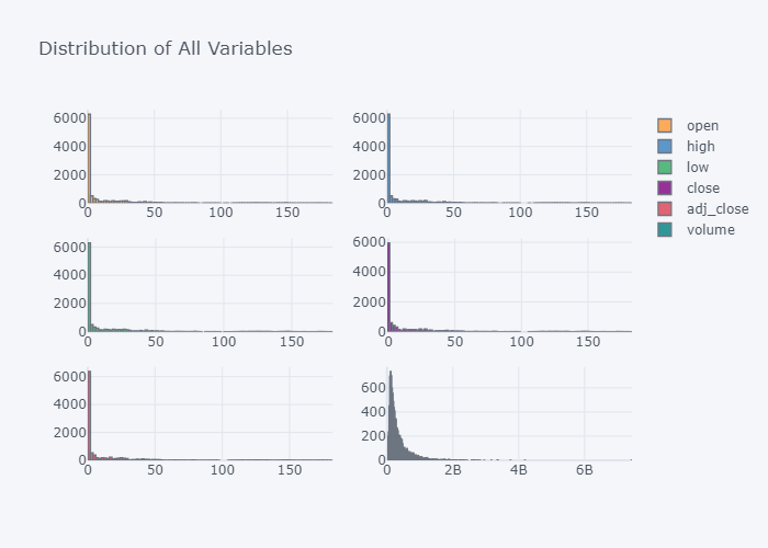
It seems that all values of the columns are left tailed.
View the Box Plot
Box Plot gives the clear picture of our descriptive nature of the data.
fig = df.iplot(kind="box",subplots=True, title="Box of All Variables", asFigure=True)
fig.write_image("stock_analysis/box.png")
fig.show()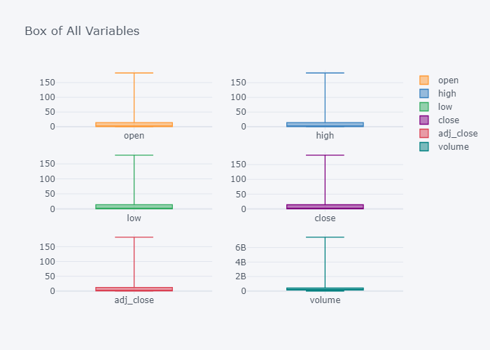
It seems that we have too many outliers but it does not matter right now.
Summary of our data
df.describe()| open | high | low | close | adj_close | volume | |
|---|---|---|---|---|---|---|
| count | 10390.000000 | 10390.000000 | 10390.000000 | 10390.000000 | 10390.000000 | 1.039000e+04 |
| mean | 13.689530 | 13.837209 | 13.542035 | 13.695320 | 13.077773 | 3.326112e+08 |
| std | 29.525352 | 29.857351 | 29.199483 | 29.542847 | 29.249790 | 3.394925e+08 |
| min | 0.049665 | 0.049665 | 0.049107 | 0.049107 | 0.038385 | 0.000000e+00 |
| 25% | 0.281250 | 0.287946 | 0.273996 | 0.281250 | 0.234167 | 1.251712e+08 |
| 50% | 0.466518 | 0.476004 | 0.459732 | 0.466518 | 0.385693 | 2.205952e+08 |
| 75% | 14.034375 | 14.205357 | 13.918214 | 14.033482 | 12.025377 | 4.136293e+08 |
| max | 182.630005 | 182.940002 | 179.119995 | 182.009995 | 181.778397 | 7.421641e+09 |
Box Plot already gave us the summary of the data. We can see that the average volume is 3.326112e+08 but will it give a true picture about the volume's flow over the course of the time? It won't because there will be certain rise and falls of the values over the time. Lets try to visualize it as line plot.
fig=df.iplot(kind="line",subplots=True, title="Trend of All Variables", asFigure=True)
fig.write_image("stock_analysis/trend.png")
fig.show()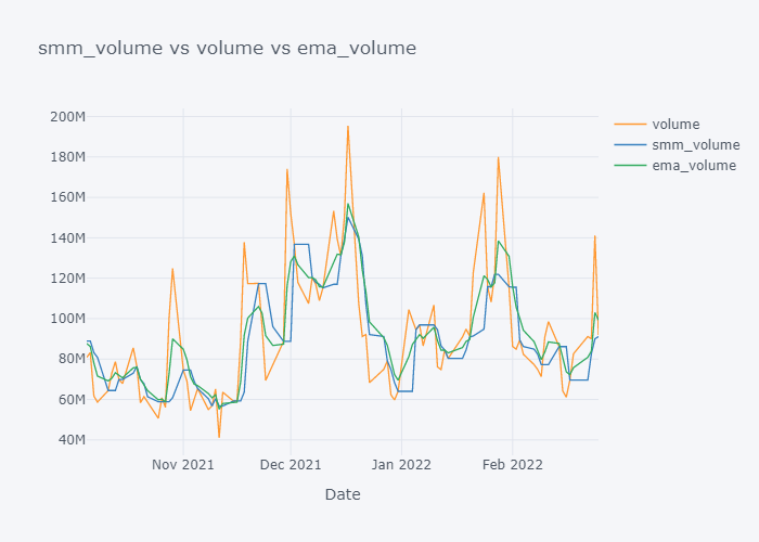
As we can see in the above plot that, the trend of the OHLC is in increasing order while Volume is not. The values of share increases/decreases but in overall, it seems to be increasing.
Moving Average
Moving average is a kind of average where we take the average of data within some time frame only. While looking at the time series data that have high volatility (e.g. standard deviation), the simple average DOES NOT give a clear picture of the mean or average value. One reason is that, in real world financial data, the amount/price does increase/decrease with some unexpected factors like COVID outbreak, or expected factors like Tesla's new car. So to get the figure that will well represent the average amount, we will take the average over some time only. By doing so, we wont be caring much about the history that is too much old and does not affect much to our present.
Simple Moving Average (SMA)
Simple Moving Average is the simplest example of the Moving Average where we take the data from some time frame and divide it by number of data points. The size of the time frame is often known as the window of movement. It is an example of Technical Indicator (heuristic or pattern-based signals produced by the price or volume).
A formula to calculate Simple Moving Average is:
$$
SMA = \frac{V_1 + V_2 + V_3 + ... + V_n}{n}
$$
Where,
- V is a value at period n
- n is number of periods
Lets try to implement this concept in our data, we will take window size or n as 5.
tdf = df.copy()
smadf = tdf.rolling(window=5).mean()
smadf| open | high | low | close | adj_close | volume | |
|---|---|---|---|---|---|---|
| Date | ||||||
| 1980-12-12 | NaN | NaN | NaN | NaN | NaN | NaN |
| 1980-12-15 | NaN | NaN | NaN | NaN | NaN | NaN |
| 1980-12-16 | NaN | NaN | NaN | NaN | NaN | NaN |
| 1980-12-17 | NaN | NaN | NaN | NaN | NaN | NaN |
| 1980-12-18 | 0.119643 | 0.119978 | 0.119420 | 0.119420 | 0.093347 | 182107520.0 |
| ... | ... | ... | ... | ... | ... | ... |
| 2022-02-18 | 170.208002 | 171.663998 | 168.304001 | 170.080002 | 170.080002 | 72770540.0 |
| 2022-02-22 | 169.730002 | 171.085999 | 167.422000 | 169.168002 | 169.168002 | 73766000.0 |
| 2022-02-23 | 168.644000 | 169.725998 | 165.322000 | 166.624005 | 166.624005 | 78910580.0 |
| 2022-02-24 | 164.789999 | 167.628000 | 161.712000 | 164.662006 | 164.662006 | 94904600.0 |
| 2022-02-25 | 163.351999 | 166.269998 | 160.191998 | 163.856006 | 163.856006 | 99363080.0 |
10390 rows × 6 columns
for c in smadf.columns:
    tdf[f"sma_{c}"] = smadf[c]
tdf| open | high | low | close | adj_close | volume | sma_open | sma_high | sma_low | sma_close | sma_adj_close | sma_volume | |
|---|---|---|---|---|---|---|---|---|---|---|---|---|
| Date | ||||||||||||
| 1980-12-12 | 0.128348 | 0.128906 | 0.128348 | 0.128348 | 0.100326 | 469033600 | NaN | NaN | NaN | NaN | NaN | NaN |
| 1980-12-15 | 0.122210 | 0.122210 | 0.121652 | 0.121652 | 0.095092 | 175884800 | NaN | NaN | NaN | NaN | NaN | NaN |
| 1980-12-16 | 0.113281 | 0.113281 | 0.112723 | 0.112723 | 0.088112 | 105728000 | NaN | NaN | NaN | NaN | NaN | NaN |
| 1980-12-17 | 0.115513 | 0.116071 | 0.115513 | 0.115513 | 0.090293 | 86441600 | NaN | NaN | NaN | NaN | NaN | NaN |
| 1980-12-18 | 0.118862 | 0.119420 | 0.118862 | 0.118862 | 0.092911 | 73449600 | 0.119643 | 0.119978 | 0.119420 | 0.119420 | 0.093347 | 182107520.0 |
| ... | ... | ... | ... | ... | ... | ... | ... | ... | ... | ... | ... | ... |
| 2022-02-18 | 169.820007 | 170.539993 | 166.190002 | 167.300003 | 167.300003 | 82614200 | 170.208002 | 171.663998 | 168.304001 | 170.080002 | 170.080002 | 72770540.0 |
| 2022-02-22 | 164.979996 | 166.690002 | 162.149994 | 164.320007 | 164.320007 | 91162800 | 169.730002 | 171.085999 | 167.422000 | 169.168002 | 169.168002 | 73766000.0 |
| 2022-02-23 | 165.539993 | 166.149994 | 159.750000 | 160.070007 | 160.070007 | 90009200 | 168.644000 | 169.725998 | 165.322000 | 166.624005 | 166.624005 | 78910580.0 |
| 2022-02-24 | 152.580002 | 162.850006 | 152.000000 | 162.740005 | 162.740005 | 141147500 | 164.789999 | 167.628000 | 161.712000 | 164.662006 | 164.662006 | 94904600.0 |
| 2022-02-25 | 163.839996 | 165.119995 | 160.869995 | 164.850006 | 164.850006 | 91881700 | 163.351999 | 166.269998 | 160.191998 | 163.856006 | 163.856006 | 99363080.0 |
10390 rows × 12 columns
Plotting SMA of All
smac = [c for c in tdf.columns if "sma" in c]
col = [c for c in tdf.columns if "sma" not in c]

for s,c in zip(smac,col):
    fig = tdf[[c, s]].iplot(kind="line", title=f"{s} vs {c}", xTitle="Date", asFigure=True)
    fig.write_image(f"stock_analysis/sma_{c}.png")
    fig.show()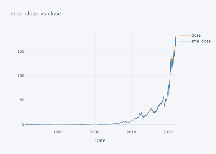
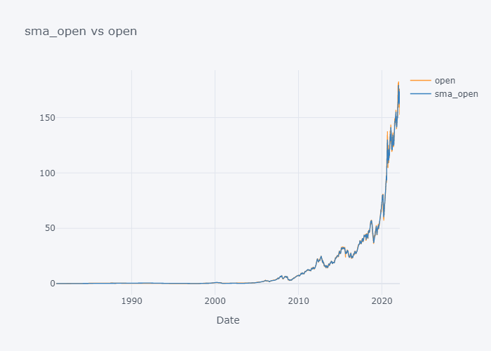
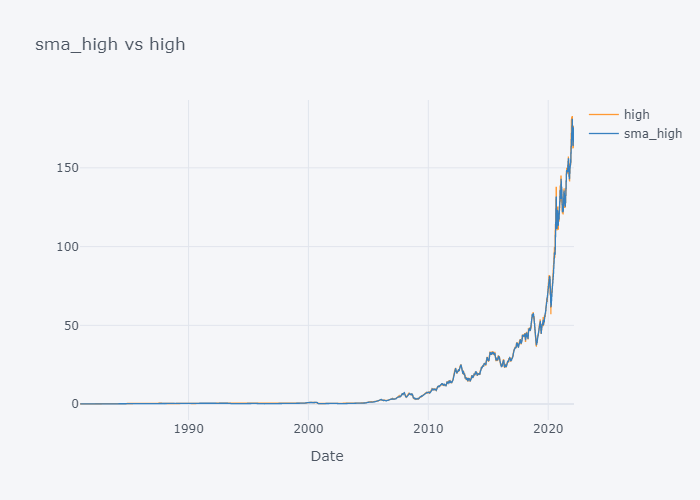
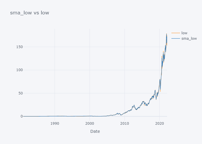
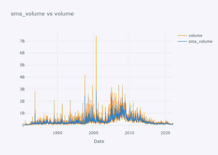
 of our data. Lets try to plot data of last 100 days only.
for s,c,w in zip(smac,col, wmac):
    fig=tdf[-100:][[c, s, w]].iplot(kind="line", title=f"{s} vs {c} vs {w}",  xTitle="Date", asFigure=True)
    fig.write_image(f"stock_analysis/sma_{c}2.png")
    fig.show()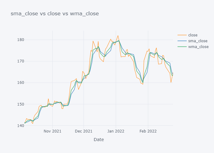
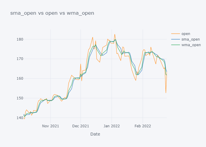
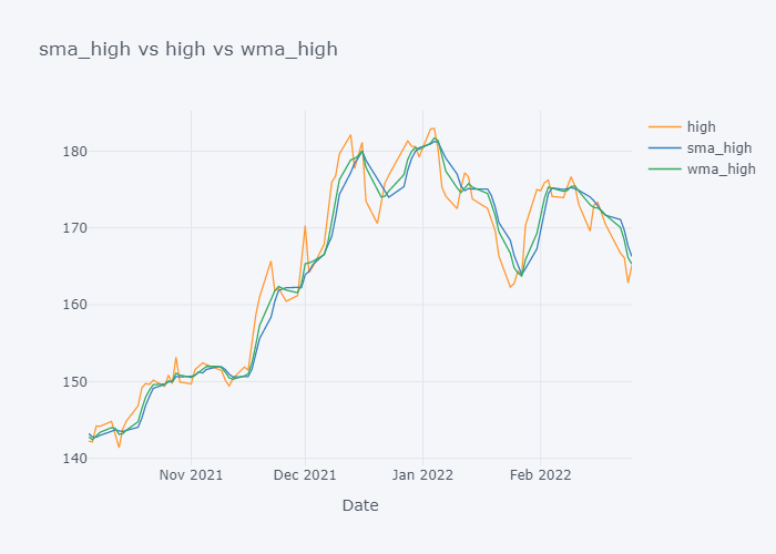
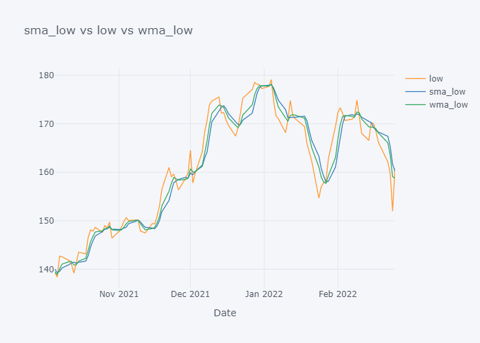
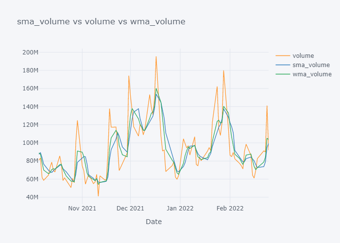
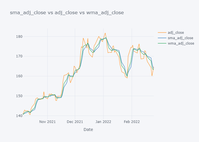
Now it is more clearer. Looking over the plot of open,
- We can clearly see that the default value of the open have some spikes and huge downfalls.
- But the value of SMA and WMA is not getting affected that much by those sudden rise/fall in the value because it contains the value from the past.
- If we look over the November to December, the Open value is increasing rapidly but the SMA is increasing slowly because it knows that there were some small values in last 5 days. Similarly WMA is also increasing slowly. But we can see that WMA is always much nearer to the Open value because it is giving much importance to the latest value.
- The sudden rise/fall in open is not the sign or price up/down in long run because one must always consider moving averages.
Exponential Moving Average (WMA)
It is similar to the WMA in the sense of giving weights to values but, instead of the linear weights, we will give exponential weights.
A general formula of EMA at time t is:
$$
EMA_t = \left[V_t \left(\frac{s}{1+d}\right)\right] + EMA_y \left[1-\left(\frac{s}{1+d}\right)\right]
$$
Where,
- EMAt is EMA value at t
- Vt is value at t
- EMAy is EMA at t-1
- s is smoothing parameter
- d is number of ts
Purpose of using EMA is to give high weights to more recent values and shows more sensitivity to more recent data. This average is more responsive to the latest price changes than SMA.
We do not have to use this scary formula from the scratch because pandas gives us some ways to do it with little code. Please refer to Pandas documentation for more info about EWM.
$$
y_0 = x_0 \\
yt = (1 - \alpha) y{t-1} + \alpha x_t,
$$
Where, alpha is either the value given by us or smoothing/(time periods+1). Smoothing is generally taken as 2 and time periods is taken as our requirement.
emadf=df.ewm(span=5, min_periods=5, adjust=True).mean()
emadf| open | high | low | close | adj_close | volume | |
|---|---|---|---|---|---|---|
| Date | ||||||
| 1980-12-12 | NaN | NaN | NaN | NaN | NaN | NaN |
| 1980-12-15 | NaN | NaN | NaN | NaN | NaN | NaN |
| 1980-12-16 | NaN | NaN | NaN | NaN | NaN | NaN |
| 1980-12-17 | NaN | NaN | NaN | NaN | NaN | NaN |
| 1980-12-18 | 0.118153 | 0.118552 | 0.117994 | 0.117994 | 0.092232 | 1.239301e+08 |
| ... | ... | ... | ... | ... | ... | ... |
| 2022-02-18 | 170.786802 | 171.961456 | 168.279383 | 169.672761 | 169.670227 | 7.574409e+07 |
| 2022-02-22 | 168.851200 | 170.204305 | 166.236253 | 167.888510 | 167.886821 | 8.088366e+07 |
| 2022-02-23 | 167.747464 | 168.852868 | 164.074169 | 165.282342 | 165.281216 | 8.392551e+07 |
| 2022-02-24 | 162.691644 | 166.851914 | 160.049446 | 164.434897 | 164.434146 | 1.029995e+08 |
| 2022-02-25 | 163.074428 | 166.274608 | 160.322962 | 164.573267 | 164.572766 | 9.929357e+07 |
10390 rows × 6 columns
for c in emadf.columns:
    tdf[f"ema_{c}"] = emadf[c]
Plotting EMA of All
Instead viewing EMA of entire data, lets view it of last 100 days only.
smac = [c for c in tdf.columns if "sma" in c]
wmac = [c for c in tdf.columns if "wma" in c]
emac = [c for c in tdf.columns if "ema" in c]
col = [c for c in tdf.columns if "sma" not in c and "wma" not in c and "ema" not in c]

for s,c,w,e in zip(smac,col, wmac, emac):
    fig=tdf[-100:][[c, s, w, e]].iplot(kind="line", title=f"{s} vs {c} vs {w} vs {e}", xTitle="Date", asFigure=True)
    fig.write_image(f"stock_analysis/ema_{c}.png")
    fig.show()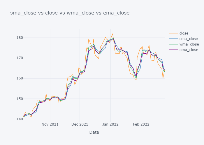
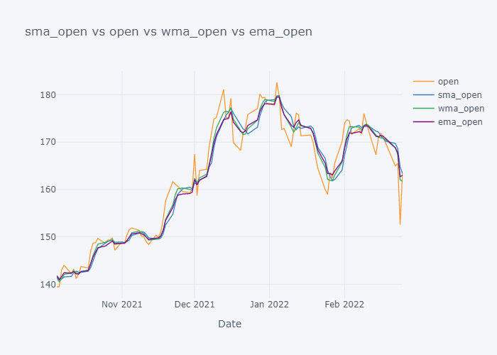
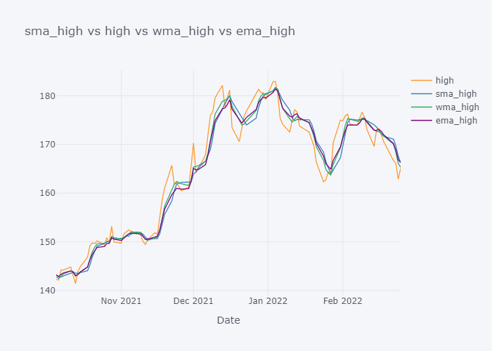
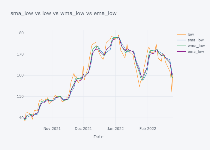
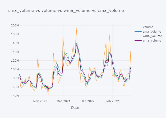

Looking over the EMA,it seems that it is much more smoother than the other values. But the smoothness depends on the value of the smoothing. Based on EMA, lots of other important metrics are calculated in Stock Market Analysis and to note down few:
- Guppy Moving Average (GMMA)
- Percentage Price Oscillator (PPO)
- Relative Strength Index (RSI)
- Moving Average Convergence Divergence (MCAD)
We will be exploring all above 4 metrics in the next blog please stay tuned for that.
Plotting Candlestick
Candlesticks are often used in stock data analysis for clear visualization and lets try that as well. We will use graph_objects of Plotly.
import plotly.graph_objects as go

fig=go.Figure()

fig.add_trace(go.Candlestick(x=tdf[-1000:].index,
                open=tdf[-1000:]['open'],
                high=tdf[-1000:]['high'],
                low=tdf[-1000:]['low'],
                close=tdf[-1000:]['close'],
                 name = 'Stock Market Data'))
fig.add_trace(go.Candlestick(x=tdf[-1000:].index,
                open=tdf[-1000:]['ema_open'],
                high=tdf[-1000:]['ema_high'],
                low=tdf[-1000:]['ema_low'],
                close=tdf[-1000:]['ema_close'],
                 name = 'EMA Stock Market Data'))

fig.update_layout(
    title= "AAPL Stock Data",
    yaxis_title="Stock's Price in USD",
    xaxis_title="Date")

fig.update_xaxes(
    rangeslider_visible=True,
    rangeselector=dict(
        buttons=list([
            dict(count=150, label="150D", step="day", stepmode="backward"),
            dict(count=4, label="4m", step="month", stepmode="backward"),
            dict(step="all")
        ])
    )
)

color_hi_fill = 'black'
color_hi_line = 'blue'

color_lo_fill = 'yellow'
color_lo_line = 'purple'

fig.data[0].increasing.fillcolor = color_hi_fill
fig.data[0].increasing.line.color = color_hi_line
fig.data[0].decreasing.fillcolor = 'rgba(0,0,0,0)'
fig.data[0].decreasing.line.color = 'rgba(0,0,0,0)'

fig.data[1].increasing.fillcolor = 'rgba(0,0,0,0)'
fig.data[1].increasing.line.color = 'rgba(0,0,0,0)'
fig.data[1].decreasing.fillcolor = color_lo_fill
fig.data[1].decreasing.line.color = color_lo_line

fig.write_image("stock_analysis/candle.png")

fig.show()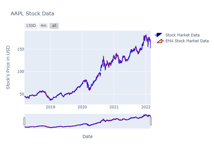
Moving Median
What if we used median instead of the mean? Lets copy and paste the codes written in above steps and calculate median instead of the mean.
tdf = df.copy()
smmdf = tdf.rolling(window=5).median()

for c in smmdf.columns:
    tdf[f"smm_{c}"] = smmdf[c]

emadf=df.ewm(span=5, min_periods=5, adjust=True).mean()

for c in emadf.columns:
    tdf[f"ema_{c}"] = emadf[c]

smmc = [c for c in tdf.columns if "smm" in c]
emac = [c for c in tdf.columns if "ema" in c]
col = [c for c in tdf.columns if "smm" not in c and "ema" not in c]

for s,c,e in zip(smmc,col,emac):
    fig=tdf[-100:][[c, s, e]].iplot(kind="line", title=f"{s} vs {c} vs {e}", xTitle="Date", asFigure=True)
    fig.write_image(f"stock_analysis/mma_{c}.png")
    fig.show()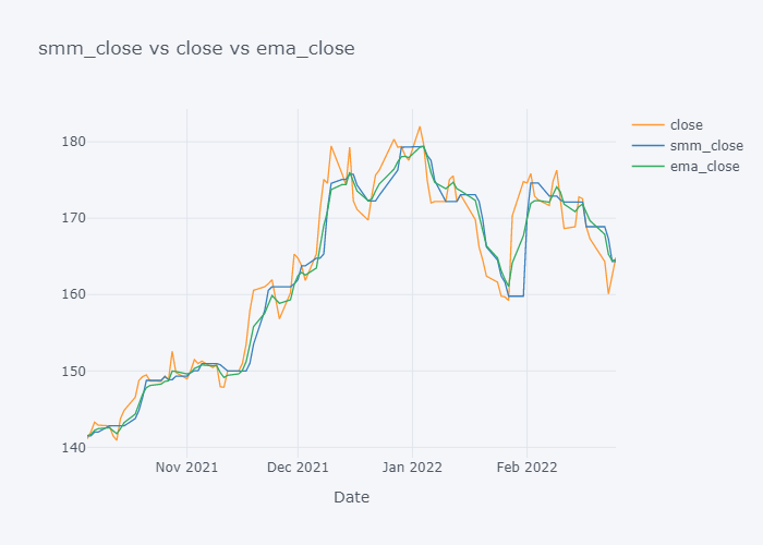
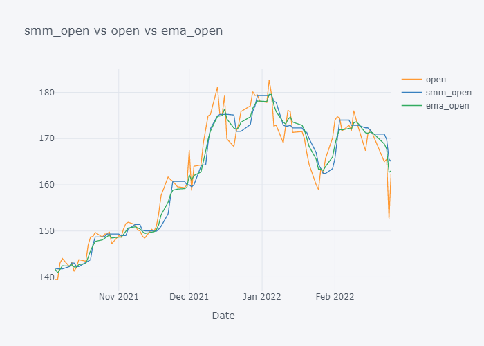
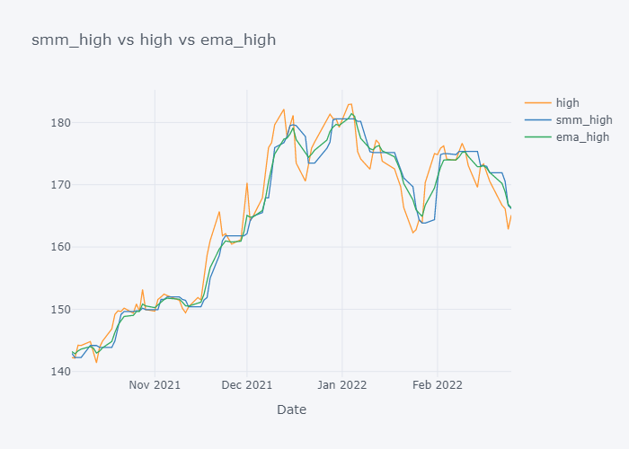
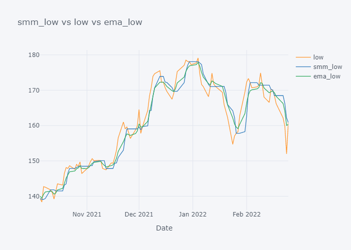

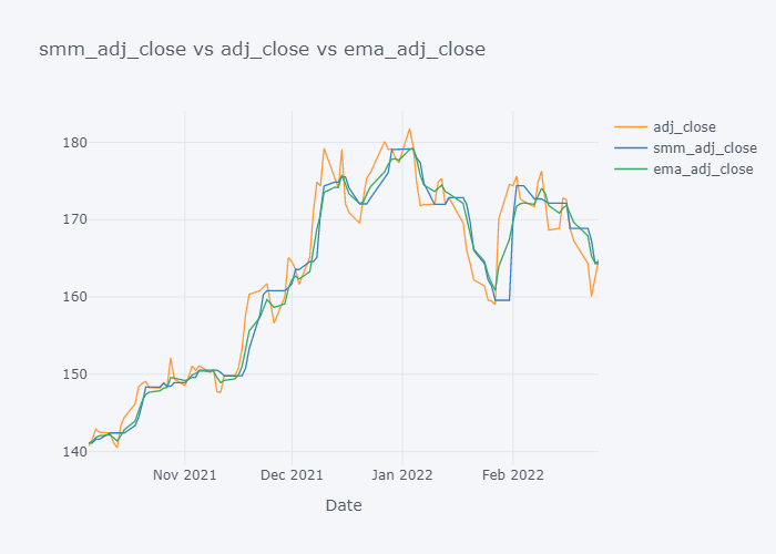
EMA seems to be much near to the open and EMA is more sensitive towards the change than Simple Moving Median.
Moving Variance
tdf = df.copy()
smmdf = tdf.rolling(window=5).var()

for c in smmdf.columns:
    tdf[f"smv_{c}"] = smmdf[c]

emadf=df.ewm(span=5, min_periods=5, adjust=True).var()

for c in emadf.columns:
    tdf[f"emv_{c}"] = emadf[c]

smmc = [c for c in tdf.columns if "smv" in c]
emac = [c for c in tdf.columns if "emv" in c]
col = [c for c in tdf.columns if "smv" not in c and "emv" not in c]

for s,c,e in zip(smmc,col,emac):
    fig=tdf[-100:][[c, s, e]].iplot(kind="line", y = [s,e], secondary_y=c, title=f"{s} vs vs {e}", xTitle="Date", asFigure=True)
    fig.write_image(f"stock_analysis/mva_{c}.png")
    fig.show()


Variance seems to be increasing when there is sudden change in the trend and it seems to be decreasing when the change seems to be normal.
Conclusion
In this blog, we have explored some of popular moving average algorithms used in the stock market analysis and in the next blog, we will explore some of the popular metrics that uses Moving Average as the base metric.