Introduction
Hello and welcome back everyone to our second part of the new blog series [Python for Stock Market Analysis](). In the last part, we explored different [types of moving averages]() like Simple Moving Average (SMA), Exponential Moving Average (EMA), Weighted Moving Average (WMA) and explored other moving metrics like Moving Median and Moving Variance. Until now we were looking only into the trend over the time and trend over the period of time. These simple metrics are used under the hood to make some assumptions in the stock markets. In this blog, we will explore some of popular metrics that are used in the stock markets which are based on Moving Averages. Please refer to the interactive version of this blog if you want to see the interactive plots.
Disclaimer: This blog is for educational purpose only and we do not recommend taking the knowledge gained from this blog to implement in real financial exercises.
Technical indicators in stock markets are categorized in many ways and some of the most common are:
- Trend Indicators
- Momentum Indicator
- Volatility Indicator
- Volume Indicator
All above 4 are used to either predict or alert us about the future of the stock. The indicators are often viewed in the terms of leading and lagging. Leading indicators give some kind of predictions about the price rise or trend by using short term moving averages (like EMA of period 12 in MACD (Moving Average Convergence Divergence)). Lagging indicators give the information that has happened and might continue to do so. Like EMA of different periods.
Before diving into the coding part, lets read our data.
import pandas as pd
import plotly.express as px
import cufflinks
import plotly.io as pio
import yfinance as yf
import warnings
warnings.filterwarnings("ignore")
cufflinks.go_offline()
cufflinks.set_config_file(world_readable=True, theme='pearl')
pio.renderers.default = "notebook" # should change by looking into pio.renderers

pd.options.display.max_columns = None
symbols = ["AAPL"]
df = yf.download(tickers=symbols)
df.head()# convert column names into lowercase
df.columns = [c.lower() for c in df.columns]
df.rename(columns={"adj close":"adj_close"},inplace=True)Trend Indicators
Trend indicators are used as a basic way to visualize the flow of the stock's performance over the course of the time (daily, monthly, weekly, in last 3 weeks etc). We can apply these indicators in stocks's performances like volume, price and transactions. Trend indicators are different in kinds and we have explored some of them in the previous blog where have explored trend of Open, High, Low and Volume of the Apple's Floorsheet data. The trend itself doesnot predict anything about the price rise or fall on the future but we can make some kind of analogy based on the recent performance of the stock.
Despite the price being high/low throughout the day, most traders find the closing price to be most important to describe the performance of the stock on that day. So, we will calculate most single variate indicators based on Closing Price of that day.
Some of popular trend indicators are:
- Moving Average
- Guppy Multiple Moving Average
- Moving Average Convergence Divergence
We will calculate these in our data next.
Moving Averages
Moving Averages are common trend indicators that are a building blocks of popular indicators like GMMA (Guppy Multiple Moving Average), MACD (Moving Average Convergence Divergence)and PPO (Percentage Price Oscillator).
But first lets write a simple function that could give us moving average of given window.
def moving_average(series, window=5, kind="sma"):
    if kind=="sma":
        return series.rolling(window=window, min_periods=window).mean()
    elif kind=="ema":
        return series.rolling(window=window, min_periods=window).mean()
    elif kind=="wma":
        return series.rolling(window=window, min_periods=window).apply(lambda x: np.average(x, weights=np.arange(1, window+1,1)))

tdf = df.copy()

window=30
tdf[f"close_sma_{window}"] = moving_average(tdf.close, window=window)
tdf[f"close_ema_{window}"] = moving_average(tdf.close, window=window, kind="ema")
tdf[f"close_wma_{window}"] = moving_average(tdf.close, window=window, kind="wma")
tdf
Trend of Closing Price Over a 30d Periods
cols = [c for c in tdf.columns if "close" in c and "adj" not in c]
tdf[cols].iplot(kind="line")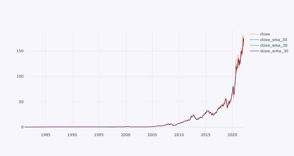
Above plot seems little bit spiked but if we zoomed it little bit, we could see the changes in the closing price and the performance of the moving averages. We can say that EMA are more closer toward the close's actual trend because it gives more importance to the latest values based on the decay term.
Guppy Multiple Moving Average (GMMA)
GMMA is a technical indicator where we use two groups of EMAs (total 12) and compare their flow over the time to make assumptions. Guppy in GMMA comes from the Australian trader named as Daryl Guppy.
- Two groups of EMAs are Long term EMA and Short term EMA. Where periods in long term EMAs (6 terms) are typically set 30, 35, 40, 45, 50 and 60. And short term EMA periods as 3, 5, 8,10, 12 and 15.
- When SEMA (Short term EMA) moves above the LEMA (Long term EMA), then it indicates a price rise in the stocks could be happening.
- Reversely, when SEMA moves below the LEMA, it indicates a price fall in the stocks could be happening.
- Trade is recommended when one group crosses over another. Which means, sell in price rise and buy in price fall case.
- The separation between two EMA groups gives a strength of the trend, thus the higher the difference between two groups of EMAs, higher the strength of rise/fall probability.
- Reversals are when SEMA crosses over LEMA and vice versa.
- Bullish crossover happens when SEMA crosses over the LEMA. And it indicates a bullish reversal occurrence.
- Bearish crossover happens when SEMA crosses below the LEMA. And it indicates a bearish reversal occurrence.
- When two groups are trending horizontally or parallel, then this the when no trend was found.
Calculation of GMMA
- Calculate EMAs for both short term and long term trends.
- Plot them and check whether a trend forms or not.
def guppy_multiple_ma(tdf,col="close", sma=[], lma=[]):
    """
        sma: [3, 5, 8, 10, 12, 15]
        lma: [30, 35, 40, 45, 50, 60]
    """

    if sma == []:
        sma =  [3, 5, 8, 10, 12, 15]#
    if lma == []:
        lma = [30, 35, 40, 45, 50, 60] #

    for sm  in sma:
        tdf[f"sema_{col}_{sm}"] = tdf[col].ewm(span=sm, min_periods=sm, adjust=False).mean()
    for lm in lma:
        tdf[f"lema_{col}_{lm}"] = tdf[col].ewm(span=lm, min_periods=lm, adjust=False).mean()
    return tdf
tdf = guppy_multiple_ma(tdf, col="close")
tdf
Viewing GMMA with Candlestick
Lets try to use candlestick to visualize OHLC and the trend at the same time. Any stick will be shown green if closing price is higher than opening and red if smaller than opening price. The top stick part is high, bottom stick part is low and top rectangle line reflects open if close is smaller else it reflects closing price. An example of candlestick is:
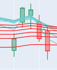
In above image, green represents where closing is greater than the opening price.
import plotly.graph_objects as go

layout = go.Layout(
    autosize=False,
    width=1000,
    height=1000,

    xaxis= go.layout.XAxis(linecolor = 'black',
                          linewidth = 1,
                          mirror = True),

    yaxis= go.layout.YAxis(linecolor = 'black',
                          linewidth = 1,
                          mirror = True),

)
fig=go.Figure(layout=layout)

lastn = 1000
ldf = tdf[-lastn:]
fig.add_trace(go.Candlestick(x=ldf.index,
                open=ldf['open'],
                high=ldf['high'],
                low=ldf['low'],
                close=ldf['close'],
                 name = 'OHLC Market Data'))

for s in tdf.columns:
    if "sema" in s:
        fig.add_trace(go.Line(x=ldf.index, y=ldf[s], line=dict(
                        color='rgb(104, 204, 204)',

                    ),
                      name=s.upper()))
    if "lema" in s:
        fig.add_trace(go.Line(x=ldf.index, y=ldf[s], line=dict(
                        color='rgb(255, 24, 24)',

                    ), name=s.upper()))

fig.update_layout(
    title= "AAPL Stock Data",
    yaxis_title="Stock's Price in USD",
    xaxis_title="Date")

fig.show()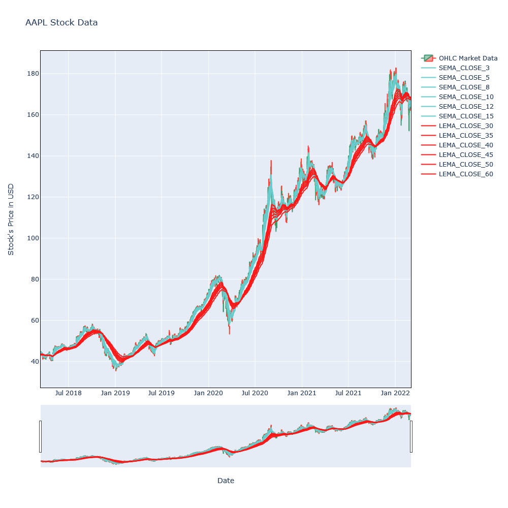
Looking over the last 1000 days of the trends, there can be seen crossover in around November 2 where SEMA were crossing over the LEMA, that is the sign of the price fall. Similarly, after February 15, SEMA again crossed over the LEMA and that is the sign of the price rise.
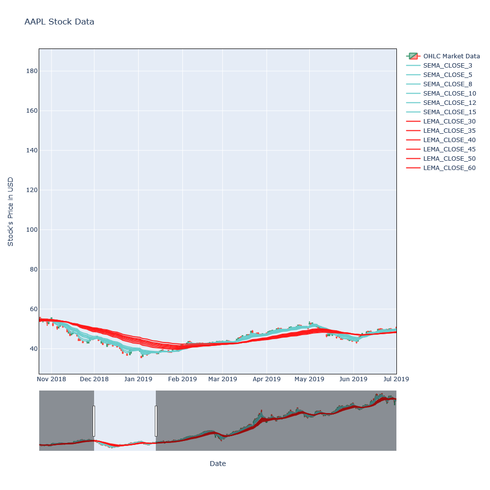
Above plot is interactive in our interactive blog, please refer there for the interactive version of this blog.
References
Percentage Price Oscillator
- This is a momentum indicator (determines the strength or weakness of a value). But we can view the volatility too.
- Two EMAs, 26 period and 12 periods are used to calculate PPO.
- It contains 2 lines, PPO line and signal line. Signal line is an EMA of the 9 Period PPO, so it moves slower than PPO.
- When PPO line crosses the signal line, it is the time for rise/fall of the price or stock.
- When PPO line crosses over the signal line from below, then it is a buy signal. Reversely, it is a sell signal when PPO line crosses belo the signal line from above.
- When PPO line is below the 0, the short term average is below the longer-term average average, which helps indicate a fall of price.
- Conversely, when PPO line is above 0, the short term average is above the long term average, which helps indicate rise of price.
Calculation
- Calculate the 12 and 26 period EMA of Closing Price.
- Apply EMAs in below formula to get current PPO value:
$$
PPO = \frac{\text{12 Period EMA - 26 Period EMA}}{\text{26 Period EMA}} * 100 \\
\text{signal_line} = \text{9 period EMA of PPO} \\
\text{PPO_histogram} = \text{PPO - Signal Line}
$$
- Calculate signal line as the 9 Period EMA of PPO generated from above step.
- We can compare different assets in terms of performance and volatility when the assets vary significantly in price.
- MACD (Moving Average Convergence Divergence) is identical to PPO in the sense that these two compares two EMAs. The main difference between these is that PPO measures percentage difference between two EMAs, while the MACD measures absolute difference.
- RSI (Relative Strength Index) is identical to PPO in the sense that these two compares two EMAs. The main difference is that it measure the magnitude of recent price changes.
def ppo(tdf, col="close", sm=12, lm=26):

    tdf[f"sema_{col}_{sm}"] = tdf[col].ewm(span=sm, min_periods=sm, adjust=False).mean()
    tdf[f"lema_{col}_{lm}"] = tdf[col].ewm(span=lm, min_periods=lm, adjust=False).mean()

    tdf["ppo"] = (tdf[f"sema_{col}_{sm}"]-tdf[f"lema_{col}_{lm}"]) / tdf[f"lema_{col}_{lm}"] * 100
    tdf["signal_line"] = tdf.ppo.ewm(span=9, min_periods=9, adjust=False).mean()
    tdf["ppo_hist"] = tdf["ppo"]-tdf["signal_line"]

    return tdf
tdf = df.copy()
tdf=ppo(tdf)
tdf
from plotly.subplots import make_subplots
fig=make_subplots(specs=[[{"secondary_y": True}]])
lastn = 1000
ldf = tdf[-lastn:]
fig.add_trace(go.Candlestick(x=ldf.index,
open=ldf['open'],
high=ldf['high'],
low=ldf['low'],
close=ldf['close'],
name = 'OHLC Market Data'))
for s in tdf.columns:
if "sema" in s:
fig.add_trace(go.Line(x=ldf.index, y=ldf[s], line=dict(
color='rgb(104, 204, 204)',
),
name=s.upper()))
if "lema" in s:
fig.add_trace(go.Line(x=ldf.index, y=ldf[s], line=dict(
color='rgb(255, 24, 24)',
), name=s.upper()))
clrred = 'rgb(222,0,0)'
clrgrn = 'rgb(0,222,0)'
clrs = [clrred if p<0 else clrgrn for p in ldf.ppo_hist]
fig.add_trace(go.Line(x=ldf.index, y=ldf.ppo, name="PPO"),secondary_y=True)
fig.add_trace(go.Bar(x=ldf.index, y=ldf.ppo_hist, name="PPO_Hist", marker=dict(color=clrs)),secondary_y=True)
fig.add_trace(go.Line(x=ldf.index, y=ldf.signal_line, name="Signal_Line"),secondary_y=True)
fig.update_layout(
title= "AAPL Stock Data (PPO Plot)",
yaxis_title="Stock's Price in USD",
xaxis_title="Date")
fig.show()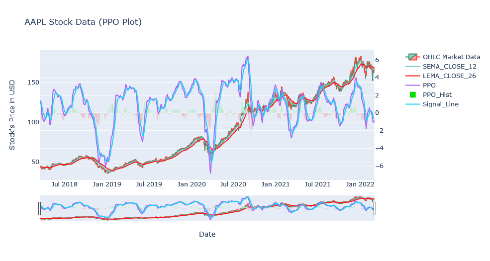
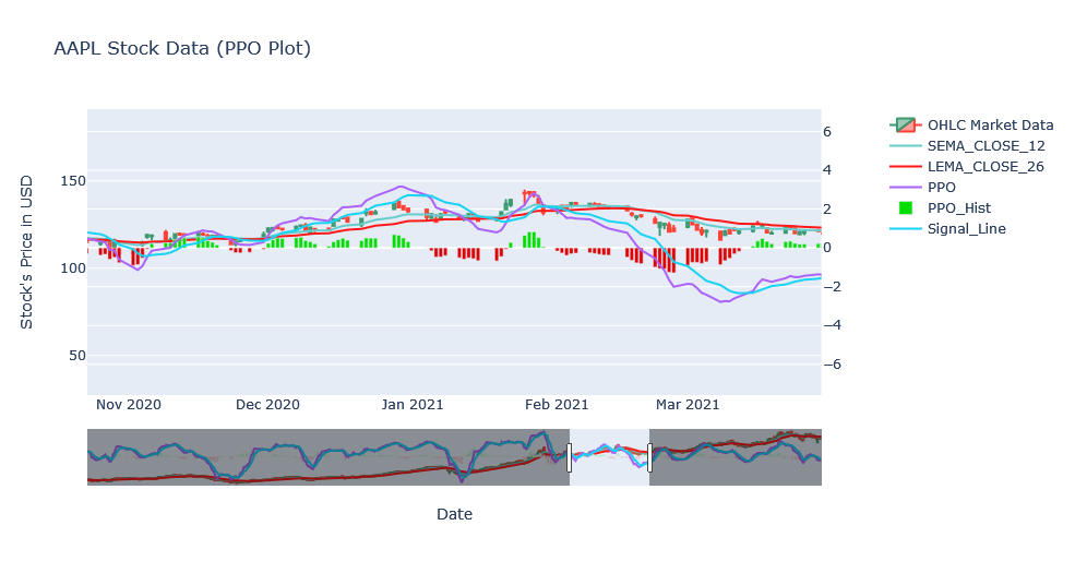
In above plot, we have changed the color of the histogram once the crossover happens. This allowed us to make assumptions based on the color. Also, we can see the performance of daily and the period of time at the same time by plotting candlestick.
Reference
Moving Average Convergence Divergence (MACD)
MACD is often considered as a Oscillator Indicator but this does give trend and some sort of volatility over a period of time by subtracting the 26 period EMA from 12 period EMA. Period in this case can be day, week, month and so on thus the periods can be changed according to our need. This is exactly similar to the PPO except we do not take Percentage.
Calculation
- When MACD crosses above 0, then bullish is considered happening and conversely, when MACd crosses below 0, then bearish is considered happening.
- Divergence happens when MACD forms highs When the MACD forms highs or lows that diverge from the corresponding highs and lows on the price, it is called a divergence.
- A bullish divergence appears when the MACD forms two rising lows that correspond with two falling lows on the price. This is a valid bullish signal when the long-term trend is still positive.
- Signal Line is plotted on the top of MACD line. Signal line is EMA of MACD of 9 period.
- When MACD crosses below the signal line, it is sign of sell and if MACD crosses above the signal line, it is a signal of sell.
def macd(tdf, col="close", sm=12, lm=26):

    tdf[f"sema_{col}_{sm}"] = tdf[col].ewm(span=sm, min_periods=sm, adjust=False).mean()
    tdf[f"lema_{col}_{lm}"] = tdf[col].ewm(span=lm, min_periods=lm, adjust=False).mean()

    tdf["macd"] = (tdf[f"sema_{col}_{sm}"]-tdf[f"lema_{col}_{lm}"])
    tdf["signal_line"] = tdf.macd.ewm(span=9, min_periods=9, adjust=False).mean()
    tdf["macd_hist"] = tdf["macd"]-tdf["signal_line"]

    return tdf
tdf = df.copy()
tdf=macd(tdf)
tdf
from plotly.subplots import make_subplots
fig=make_subplots(specs=[[{"secondary_y": True}]])
lastn = 1000
ldf = tdf[-lastn:]
fig.add_trace(go.Candlestick(x=ldf.index,
open=ldf['open'],
high=ldf['high'],
low=ldf['low'],
close=ldf['close'],
name = 'OHLC Market Data'))
for s in tdf.columns:
if "sema" in s:
fig.add_trace(go.Line(x=ldf.index, y=ldf[s], line=dict(
color='rgb(104, 204, 204)',
),
name=s.upper()))
if "lema" in s:
fig.add_trace(go.Line(x=ldf.index, y=ldf[s], line=dict(
color='rgb(255, 24, 24)',
), name=s.upper()))
clrred = 'rgb(222,0,0)'
clrgrn = 'rgb(0,222,0)'
clrs = [clrred if p<0 else clrgrn for p in ldf.macd_hist]
fig.add_trace(go.Line(x=ldf.index, y=ldf.macd, name="MACD"),secondary_y=True)
fig.add_trace(go.Bar(x=ldf.index, y=ldf.macd_hist, name="MACD_Hist", marker=dict(color=clrs)),secondary_y=True)
fig.add_trace(go.Line(x=ldf.index, y=ldf.signal_line, name="Signal_Line"),secondary_y=True)
fig.update_layout(
title= "AAPL Stock Data (MACD Plot)",
yaxis_title="Stock's Price in USD",
xaxis_title="Date")
fig.show()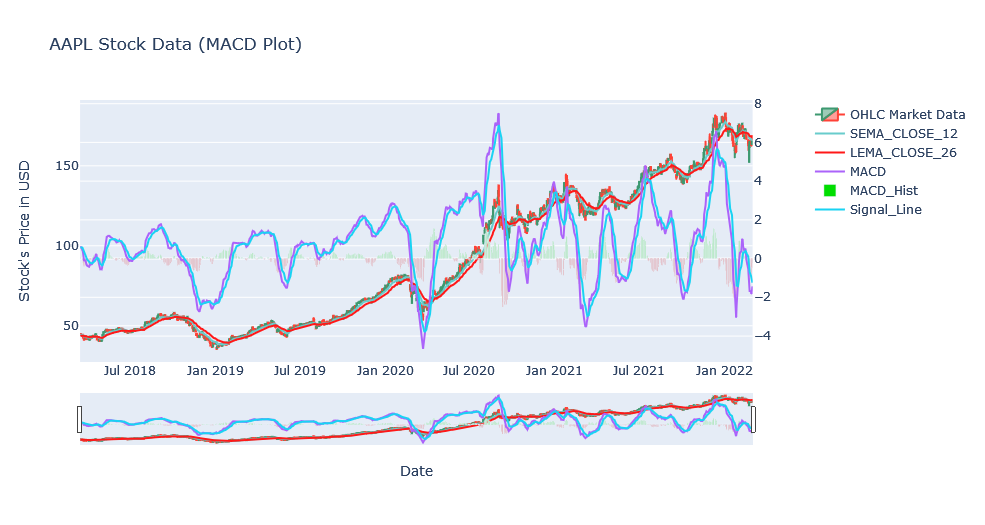
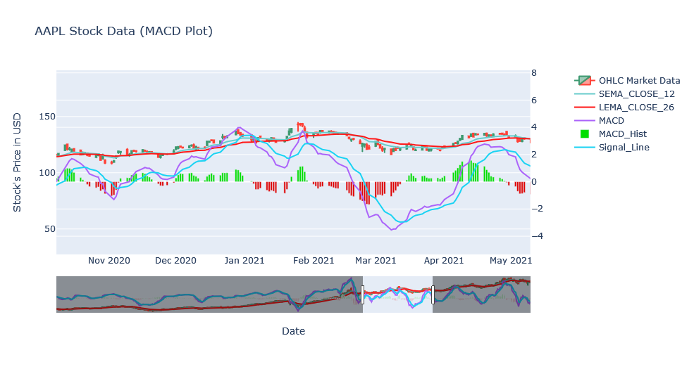
Above plot looks similar to the PPO plot and it is because they both use same EMAs and only difference is the percentage. Looking over a zoomed version.
References
Conclusion
In this blog, we we explored some of popular trend indicators like GMMA, PPO and MACD. In the next blog, we will explore other indicators and so on. This blogging series will not end soon :P.