Plotting High Quality Plots in Python with Plotly and Clufflinks
Interactive Plot
This blog contains static images and is not rendering interactive plots thus we request you to visit
Introduction
Hello everyone, in this blog we are going to explore some of most used and simplest plots in the data analysis. If you have made your hand dirty playing with data then you might have come across at least anyone of these plots. And in Python, we have been doing these plots using Matplotlib. But above that, we have some tools like Seaborn (built on the top of Matplotlib) which gave use nice graphs. But those were not interactive plots. Plotly is all about interactivity!
This blog will be updated frequently.
- January 28 2022, started blog writing.
Installation
This blog was prepared and run on the google colab and if you are trying to run codes in local computer, please install plotly first by pip install plotly. You can visit official link if you want. Then cufflinks by pip install cufflinks. Pandas DataFrame object has no attribute 'iplot' or we do not have interactive plot method in Pandas but using cufflinks, we could link them.
import pandas as pd
import numpy as np
import warnings
from plotly.offline import init_notebook_mode, iplot
import plotly.figure_factory as ff
import cufflinks
import plotly.io as pio
cufflinks.go_offline()
cufflinks.set_config_file(world_readable=True, theme='pearl')
pio.renderers.default = "colab" # should change by looking into pio.renderers

pd.options.display.max_columns = None
# pd.options.display.max_rows = Nonepio.renderersRenderers configuration
-----------------------
Default renderer: 'colab'
Available renderers:
['plotly_mimetype', 'jupyterlab', 'nteract', 'vscode',
'notebook', 'notebook_connected', 'kaggle', 'azure', 'colab',
'cocalc', 'databricks', 'json', 'png', 'jpeg', 'jpg', 'svg',
'pdf', 'browser', 'firefox', 'chrome', 'chromium', 'iframe',
'iframe_connected', 'sphinx_gallery', 'sphinx_gallery_png']If you are running Plotly on colab then use pio.renderers.default = "colab" else choose according to your need.
Get Dataset
For the purpose of visualization, we are going to look into COVID 19 Dataset publicly available on GitHub.
Since the main goal of this blog is to explore visualization not the analysis part, we will be skipping most of analysis and focus only on the plots.
df = pd.read_csv("https://covid.ourworldindata.org/data/owid-covid-data.csv")
df["date"] = pd.to_datetime(df.date)
df
Data is not shown here to avoid huge page.
157476 rows × 67 columns
Check Missing Columns
First step of any data analysis is checking for missing columns.
total = df.isnull().sum().sort_values(ascending = False)
percent = (df.isnull().sum()/df.isnull().count()).sort_values(ascending = False)
mdf = pd.concat([total, percent], axis=1, keys=['Total', 'Percent'])
mdf = mdf.reset_index()
mdf| index | Total | Percent | |
|---|---|---|---|
| 0 | weekly_icu_admissions | 153085 | 0.972116 |
| 1 | weekly_icu_admissions_per_million | 153085 | 0.972116 |
| 2 | excess_mortality_cumulative_per_million | 152056 | 0.965582 |
| 3 | excess_mortality | 152056 | 0.965582 |
| 4 | excess_mortality_cumulative_absolute | 152056 | 0.965582 |
| ... | ... | ... | ... |
| 62 | total_cases | 2850 | 0.018098 |
| 63 | population | 1037 | 0.006585 |
| 64 | date | 0 | 0.000000 |
| 65 | location | 0 | 0.000000 |
| 66 | iso_code | 0 | 0.000000 |
67 rows × 3 columns
It seems that we have lots of missing data (97%+).
Pie Chart
Missing Values Columns
How about plotting the counts of missing columns in pie chart?
To make it more fast, we will be using only columns that are missing more than 100000 values.
mdf.query("Total>100000").iplot(kind='pie',labels = "index",
                                values="Total", textinfo="percent+label",
                                title='Top Columns with Missing Values', hole = 0.5)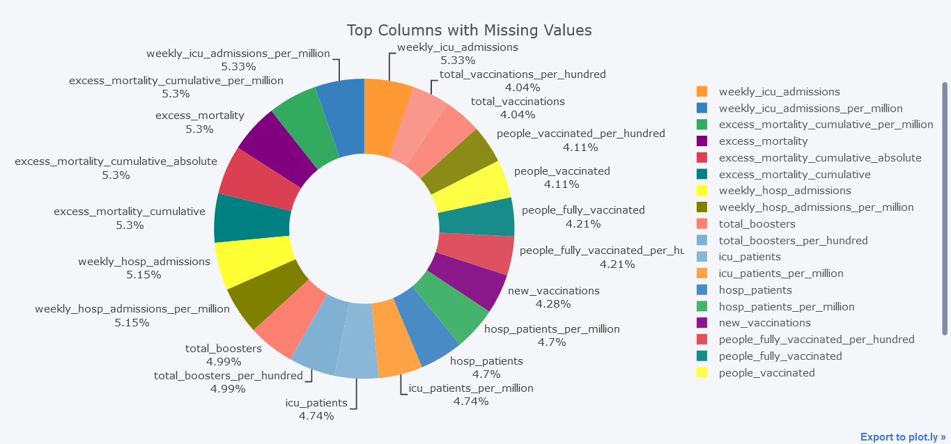
Above plot seems little bit dirty and we could smoothen it by not providing textinfo.
mdf.query("Total>100000").iplot(kind='pie',labels = "index",
                                values="Total",
                                title='Top Columns with Missing Values', hole = 0.5)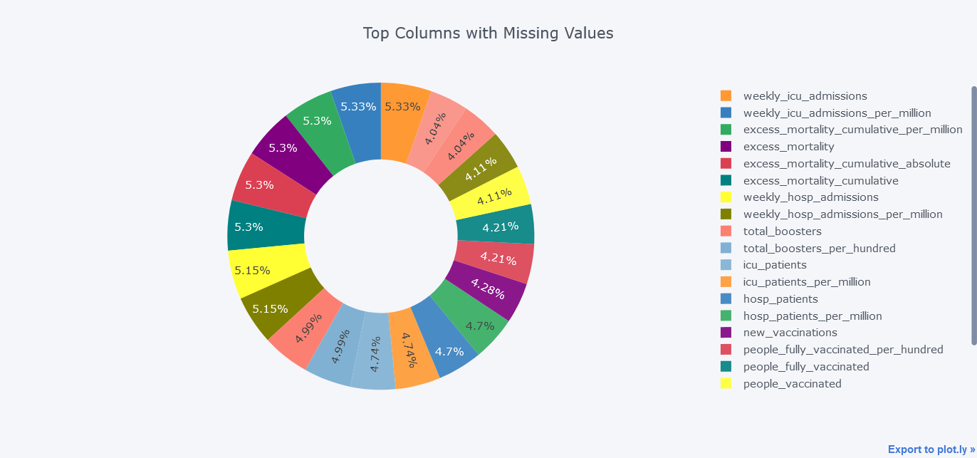
Line Chart
New Cases Per day
The location field of our data seems to be having country name, continent name and world so we will skip those locations first. Then we will calculate the aggregated value of each day by grouping on date level
Lets first plot simple line chart with only total cases. But we could always plot more lines within it.
todf = df[~df.location.isin(["Lower middle income", "North America", "World", "Asia", "Europe",
                           "European Union", "Upper middle income",
                           "High income", "South America"])]
tdf = todf.groupby("date").aggregate(new_cases=("new_cases", "sum"),
                                   new_deaths = ("new_deaths", "sum"),
                                   new_vaccinations = ("new_vaccinations", "sum"),
                                   new_tests = ("new_tests", "sum")
                                   ).reset_index()

tdf.iplot(kind="line",
          y="new_cases",
          x="date",
          xTitle="Date",
          width=2,
          yTitle="new_cases",
          title="New Cases from Jan 2020 to Jan 2022")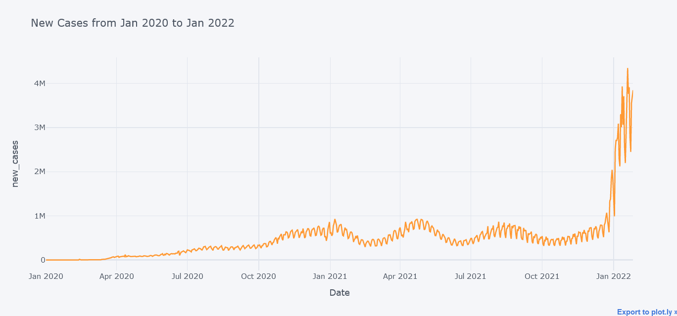
Above plot seems to be cool but now lets plot multiple lines at the same time on same figure.
tdf.iplot(kind="line",
          y=["new_deaths", "new_vaccinations", "new_tests"],
          x="date",
          xTitle="Date",
          width=2,
          yTitle="Cases",
          title="Cases from Jan 2020 to Jan 2022")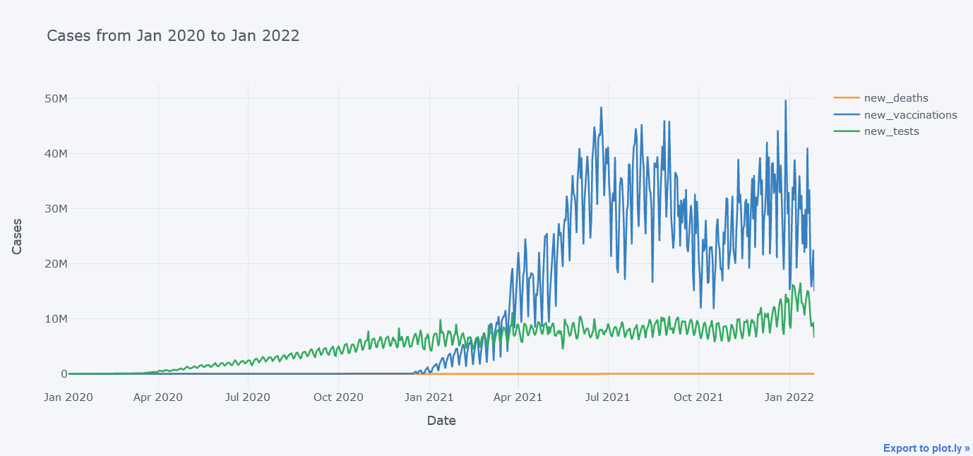
It does not look that good because the new_deaths is not clearly visible lets draw them in sub plots so that we could see each lines distinctly.
tdf.iplot(kind="line",
          y=["new_deaths", "new_vaccinations", "new_tests"],
          x="date",
          xTitle="Date",
          width=2,
          yTitle="Cases",
          subplots=True,
          title="Cases from Jan 2020 to Jan 2022")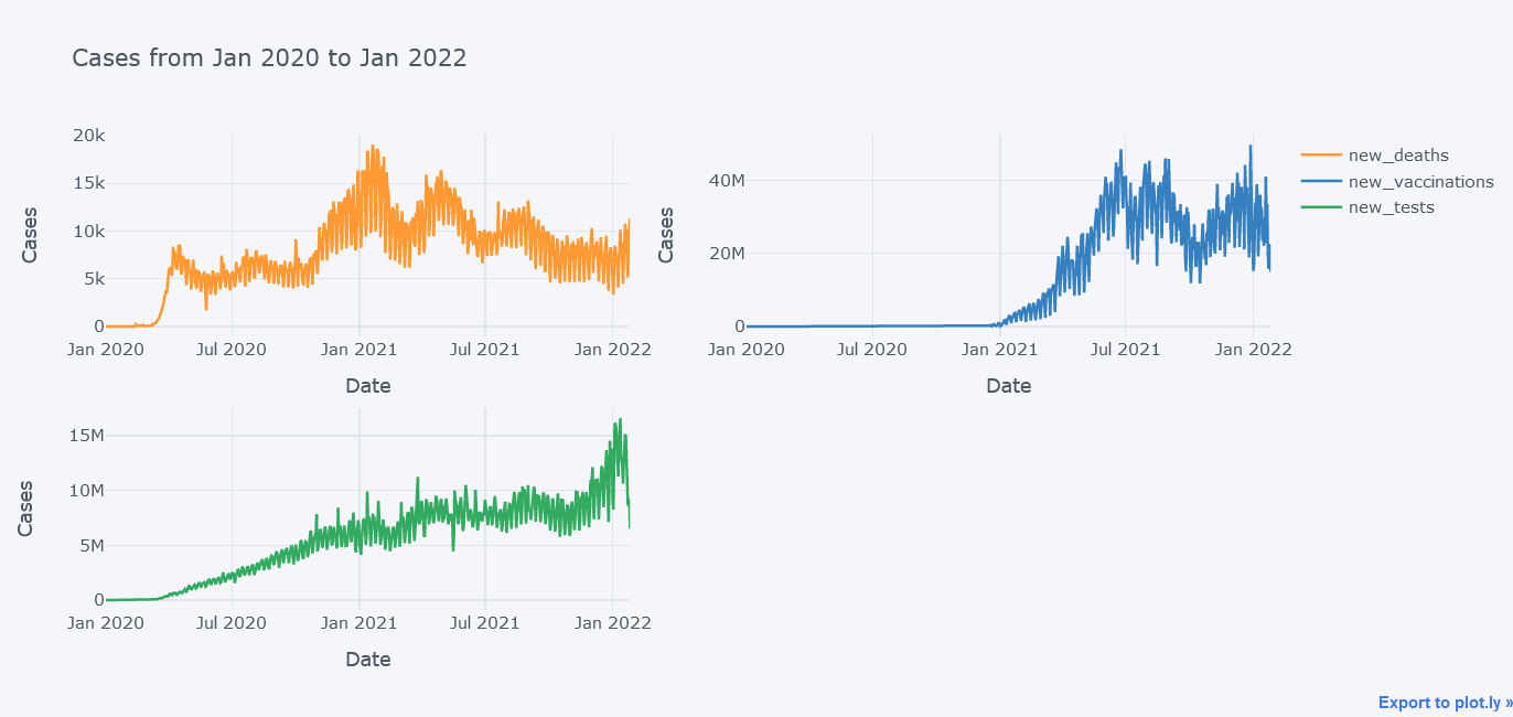
Now its better.
We could even plot secondary y variable. Now lets plot new tests and new vaccinations side by side.
tdf.iplot(kind="line",
          y=["new_vaccinations"],
          secondary_y = "new_tests",
          x="date",
          xTitle="Date",
          width=2,
          yTitle="new_vaccinations",
          secondary_y_title="new_tests",
          title="Cases from Jan 2020 to Jan 2022")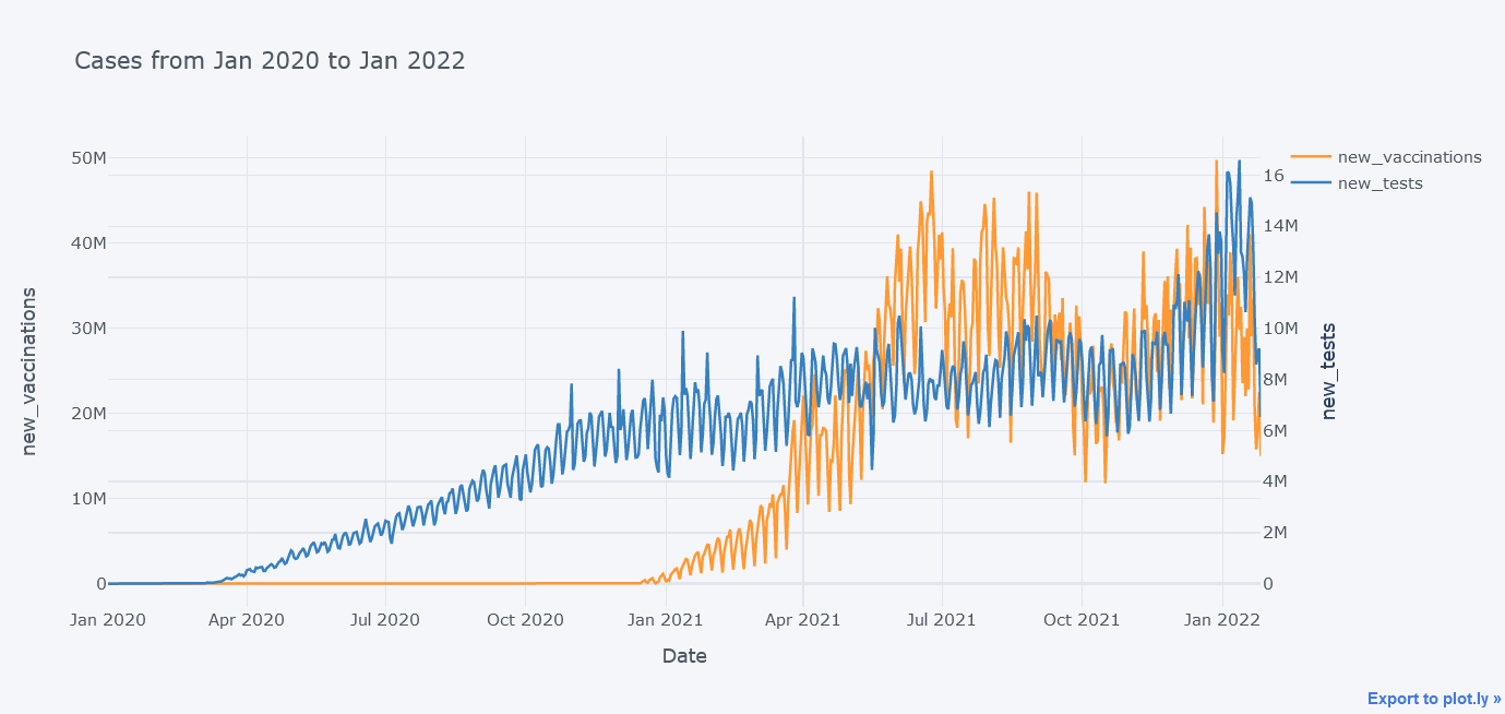
In above plot, we were able to insert two y axes.
Scatter Plot
New deaths vs New Cases
How about viewing the deaths vs cases in scatter plot?
tdf.iplot(kind="scatter",
              y="new_deaths", x='new_cases',
              mode='markers',
              yTitle="New Deaths", xTitle="New Cases",
              title="New Deaths vs New Cases")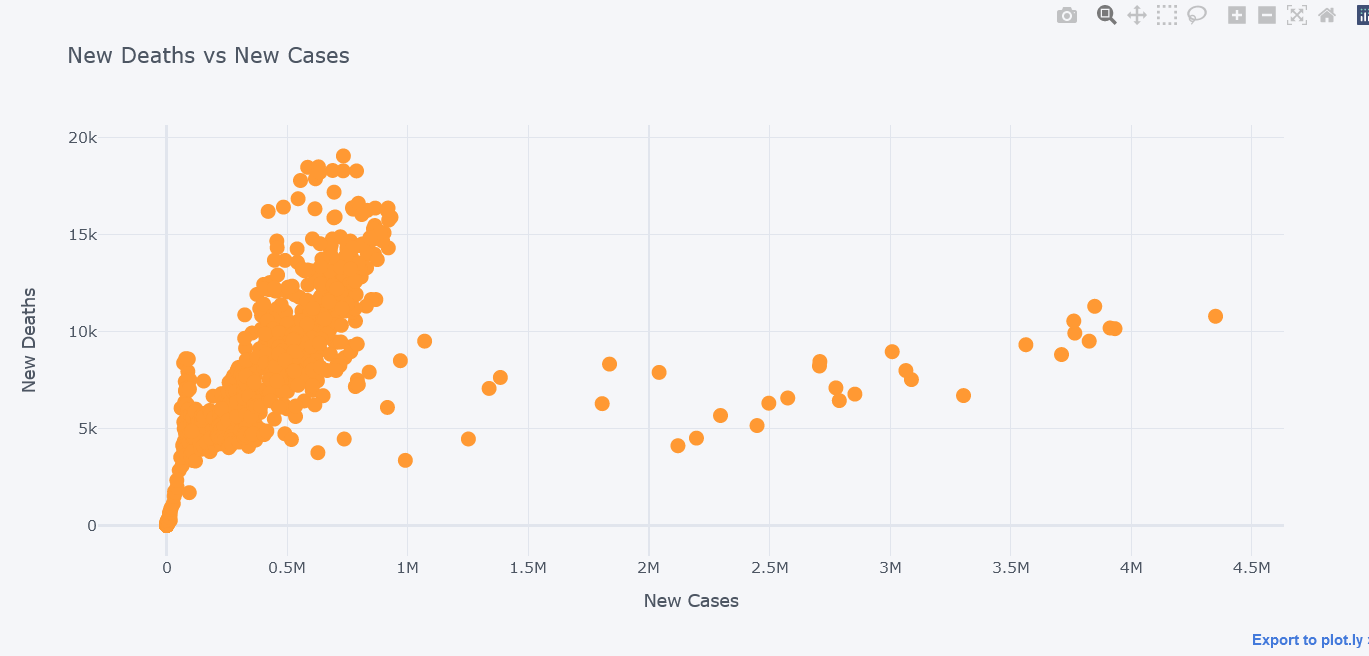
It seems that most of the deaths happened while cases were little.
We could even plot secondary y. Lets visualize new tests along with them.
tdf.iplot(kind="scatter",
              x="new_deaths", y='new_cases',
              secondary_y="new_tests",
              secondary_y_title="New Tests",
              mode='markers',
              xTitle="New Deaths", yTitle="New Cases",
              title="New Deaths vs New Cases")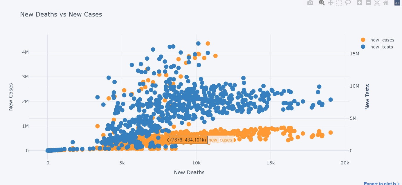
We could even use subplots on it.
tdf.iplot(kind="scatter",
              x="new_deaths", y='new_cases',
              secondary_y="new_tests",
              secondary_y_title="New Tests",
              mode='markers',
              subplots=True,
              xTitle="New Deaths", yTitle="New Cases",
              title="New Deaths vs New Cases")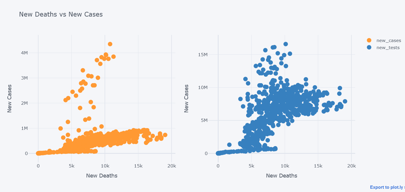
Bar Plot
How about plotting top 20 countries where most death have occured?
But first, take the aggregate data by taking maximum of total deaths column. Thanks to the author of this dataset we do not have to make our hands dirty much. Then take top 20 by using nlargest.
tdf = df[~df.location.isin(["Lower middle income", "North America", "World", "Asia", "Europe",
                           "European Union", "Upper middle income",
                           "High income", "South America"])].groupby("location").aggregate(total_deaths=("total_deaths", "max"),
                                                                                           total_cases = ("total_cases", "max"),
                                                                                           total_tests = ("total_tests", "max")).reset_index()
topdf = tdf.nlargest(20, "total_deaths")
topdf.iplot(kind="bar", x="location",
                                      y="total_deaths",
                                      theme="polar",
                                      xTitle="Countries", yTitle="Total Deaths",
                                       title="Top 20 Countries according to total deaths")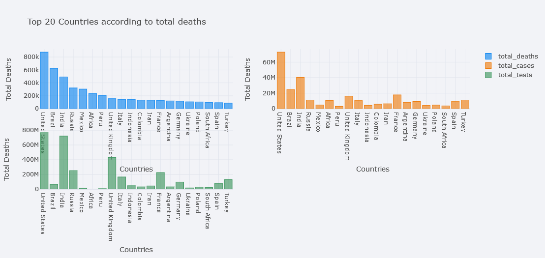
It seems awesome. We could play with theme also.
We could even make it horizontal.
topdf.iplot(kind="bar", x="location",
            y="total_deaths",
            theme="polar", orientation='h',
            xTitle="Countries", yTitle="Total Deaths",
            title="Top 20 Countries according to total deaths")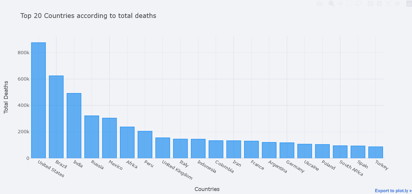
We could even plot multiple bars at the same time. In seaborn, we could do this by using Hue but here, we only have to pass it in y. Lets plot bars of total deaths, total cases and total tests.
topdf.iplot(kind="bar", x="location",
            y=["total_deaths", "total_cases", "total_tests"],
            theme="polar",
            xTitle="Countries", yTitle="Total Deaths",
            title="Top 20 Countries according to total deaths")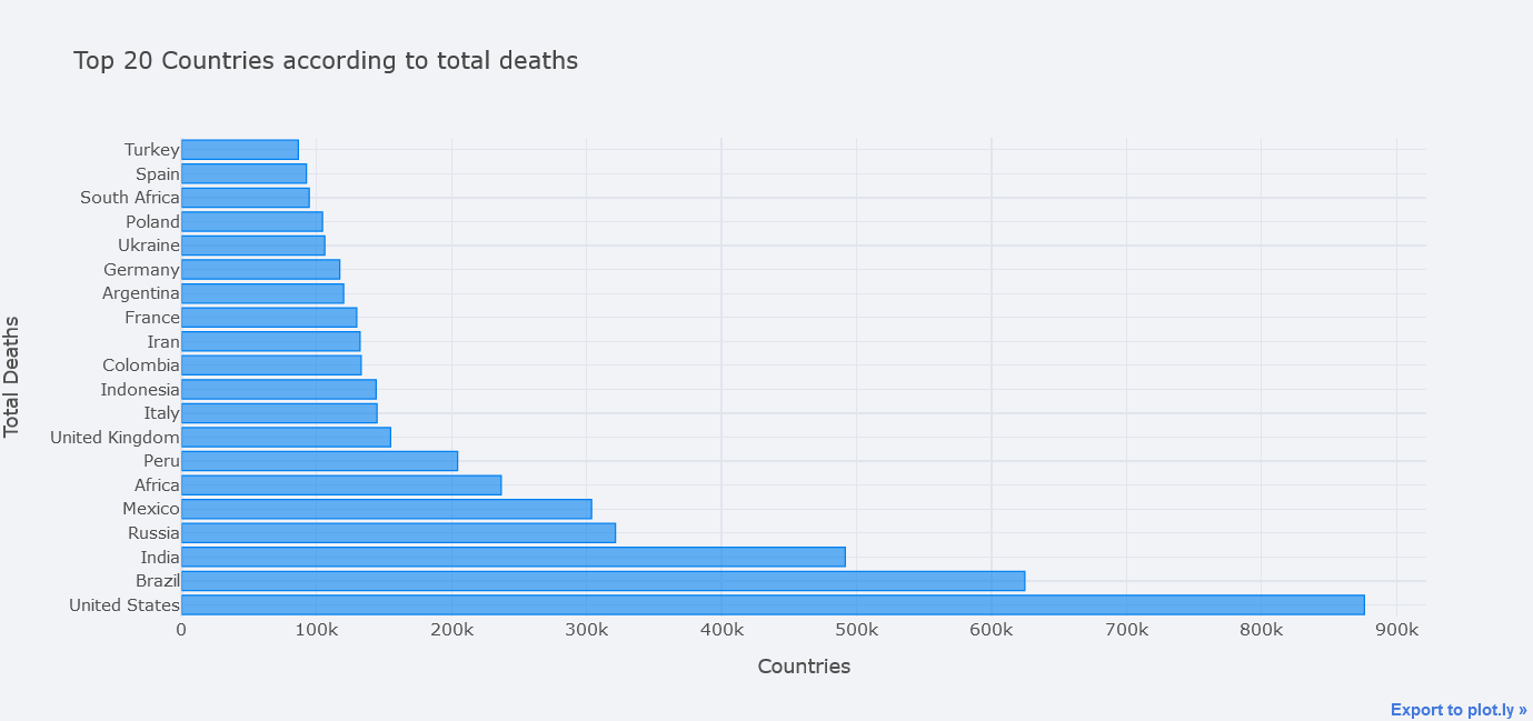
But total deaths is not visible clearly, lets try to use different mode of bar. We could choose one from the 'stack', 'group', 'overlay', 'relative'.
topdf.iplot(kind="bar", x="location",
                        y=["total_deaths", "total_cases", "total_tests"],
                        theme="polar",
                        barmode="overlay",
                        xTitle="Countries", yTitle="Total Deaths",
                        title="Top 20 Countries according to total deaths")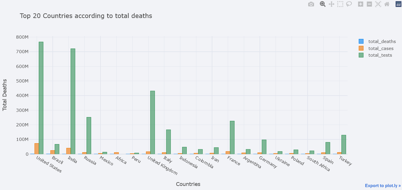
But it is still not clear. One solution is to plot in subplots.
topdf.iplot(kind="bar", x="location",
                        y=["total_deaths", "total_cases", "total_tests"],
                        theme="polar",
                        barmode="overlay",
                        xTitle="Countries", yTitle="Total Deaths",
                        subplots=True,
                        title="Top 20 Countries according to total deaths")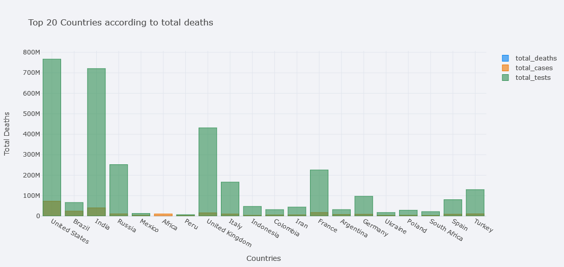
Much better.
Histogram Chart
How about viewing the distribution of totel tests done?
tdf.iplot(kind="hist",
              bins=50,
              colors=["red"],
              keys=["total_tests"],
              title="Total tests Histogram")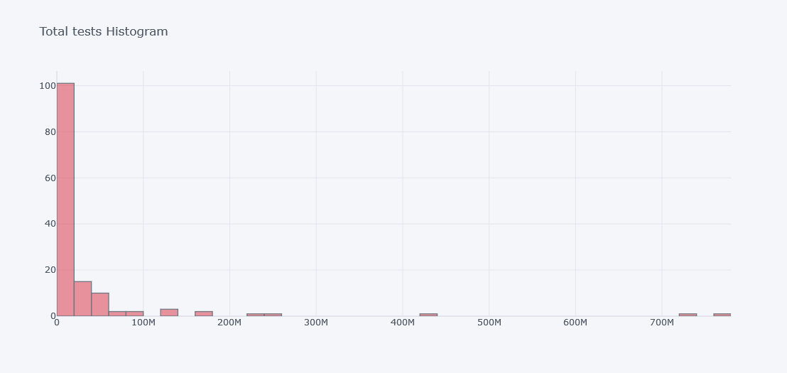
To see histogram of other columns in same figure we will use keys.
tdf.iplot(kind="hist",
              bins=100,
              colors=["red"],
              keys=["total_tests", "total_cases", "total_deaths"],
              title="Multiple Histogram")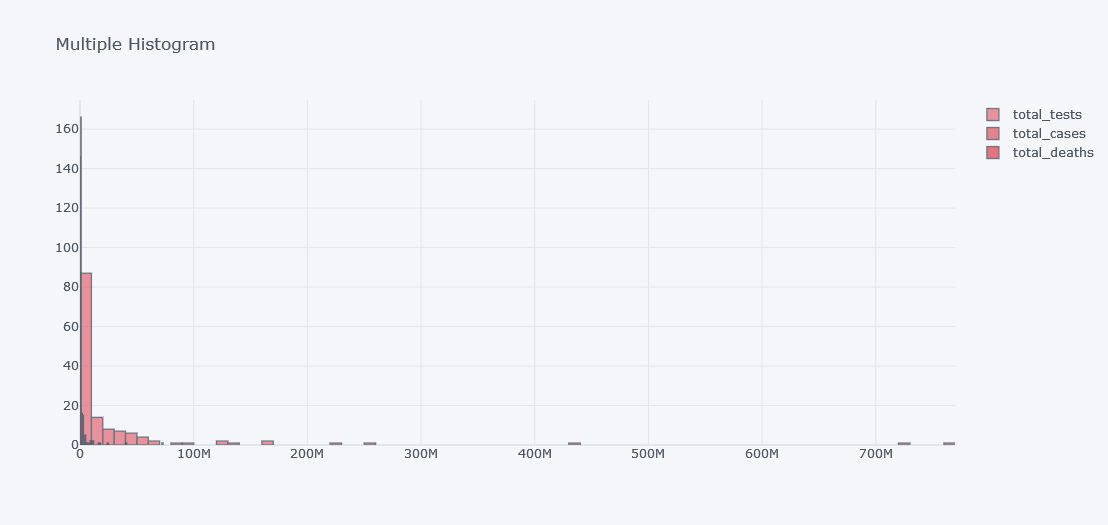
It does not look good as the data is not distributed properly. Lets visualize it in different plots.
tdf.iplot(kind="hist",
              subplots=True,
              keys=["total_tests", "total_cases", "total_deaths"],
              title="Multiple Histogram")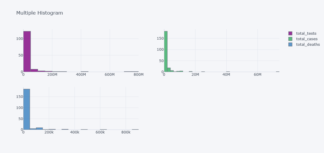
Box Plot
How about viewing outliers in data?
tdf.iplot(kind="box",
              keys=["total_tests", "total_cases", "total_deaths"],
              boxpoints="outliers",
              x="location",
              xTitle="Columns", title="Box Plot Tests, Cases and Deaths")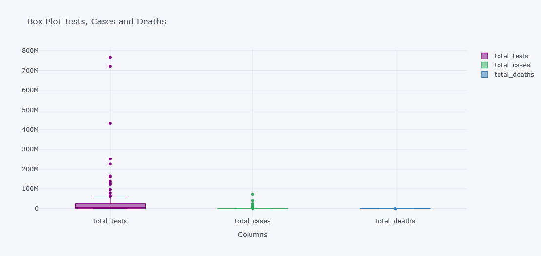
It is not clearly visible as the data have lot of outliers and not all columns have similar distributions.
tdf.iplot(kind="box",
              keys=["total_tests", "total_cases", "total_deaths"],
              boxpoints="outliers",
              x="location",
              subplots=True,
              xTitle="Columns", title="Box Plot Tests, Cases and Deaths")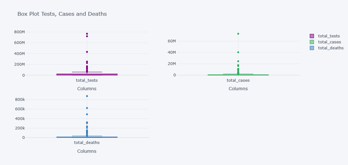
HeatMaps
How about viewing the correlation between columns? We will not check with all the 67 columns but lets test with 3.
df[["new_cases", "new_deaths", "new_tests"]].corr().iplot(kind="heatmap")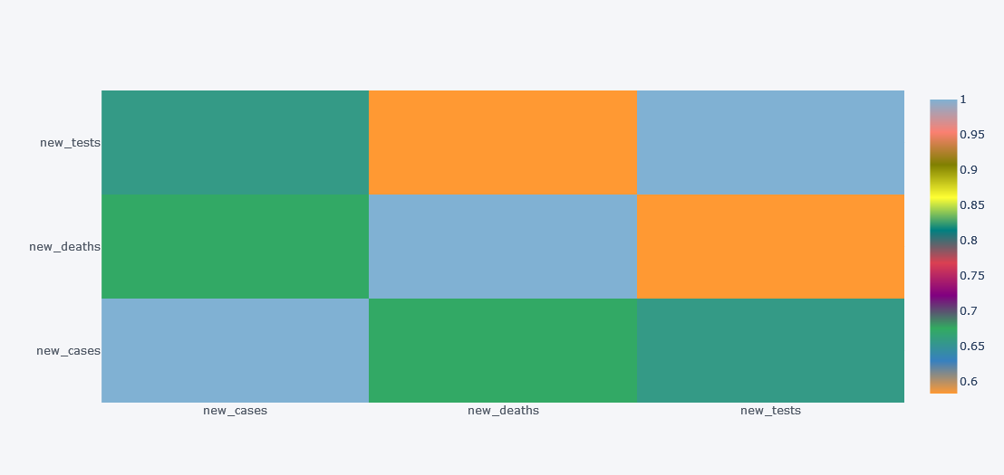
Simple yet much informative and interactive right?
Choropleth on Map
Plotting on map was once mine dream but now it can be done within few clicks.
Lets plot a choropleth on world map for the total deaths as of the latest day
import plotly.graph_objects as go

ldf = df[~df.location.isin(["Lower middle income", "North America", "World", "Asia", "Europe",
                           "European Union", "Upper middle income",
                           "High income", "South America"])].drop_duplicates("location", keep="last")

fig = go.Figure(data=go.Choropleth(
    locations = ldf['iso_code'],
    z = ldf['total_deaths'],
    text = ldf['location'],
    colorscale = 'Blues',
    autocolorscale=False,
    reversescale=True,
    marker_line_color='darkgray',
    marker_line_width=0.5,
    colorbar_title = 'total_deaths',
))

fig.update_layout(
    title_text='total_deaths vs Country',
    geo=dict(
        showframe=False,
        showcoastlines=False,
        projection_type='equirectangular'
    )
)

fig.show()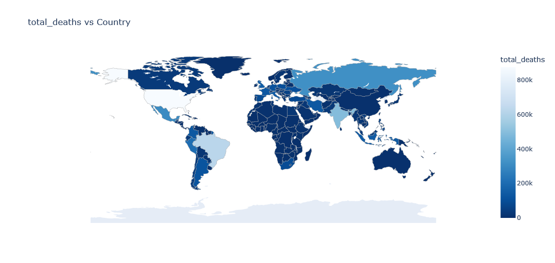
Above plot is of current date only but what if w want to view data of each available date?
Choropleth with Slider
We could add a slider to slide between different dates but it will be too much power hungry plot so beware of your system. We will plot total number of cases at the end of the month for each country.
tldf = df[~df.location.isin(["Lower middle income", "North America", "World", "Asia", "Europe",
                           "European Union", "Upper middle income",
                           "High income", "South America"])]
tldf = tldf.groupby(["location", "iso_code", pd.Grouper(key="date", freq="1M")]).aggregate(total_cases=("total_cases", "max")).reset_index()
tldf["date"] = tldf["date"].dt.date
tldf
| location | iso_code | date | total_cases | |
|---|---|---|---|---|
| 0 | Afghanistan | AFG | 2020-02-29 | 5.0 |
| 1 | Afghanistan | AFG | 2020-03-31 | 166.0 |
| 2 | Afghanistan | AFG | 2020-04-30 | 1827.0 |
| 3 | Afghanistan | AFG | 2020-05-31 | 15180.0 |
| 4 | Afghanistan | AFG | 2020-06-30 | 31445.0 |
| ... | ... | ... | ... | ... |
| 5101 | Zimbabwe | ZWE | 2021-09-30 | 130820.0 |
| 5102 | Zimbabwe | ZWE | 2021-10-31 | 132977.0 |
| 5103 | Zimbabwe | ZWE | 2021-11-30 | 134625.0 |
| 5104 | Zimbabwe | ZWE | 2021-12-31 | 213258.0 |
| 5105 | Zimbabwe | ZWE | 2022-01-31 | 228943.0 |
5106 rows × 4 columns
first_day = tldf.date.min()

scl = [[0.0, '#ffffff'],[0.2, '#b4a8ce'],[0.4, '#8573a9'],
       [0.6, '#7159a3'],[0.8, '#5732a1'],[1.0, '#2c0579']] # purples

data_slider = []
for date in tldf['date'].unique():
    df_segmented =  tldf[(tldf['date']== date)]

    for col in df_segmented.columns:
        df_segmented[col] = df_segmented[col].astype(str)

    data_each_yr = dict(
                        type='choropleth',
                        locations = df_segmented['iso_code'],
                        z=df_segmented["total_cases"].astype(float),
                        colorbar= {'title':'Total Cases'}
                        )

    data_slider.append(data_each_yr)

steps = []
for i,date in enumerate(tldf.date.unique()):
    step = dict(method='restyle',
                args=['visible', [False] * len(data_slider)],
                label='Date {}'.format(date))
    step['args'][1][i] = True
    steps.append(step)

sliders = [dict(active=0, pad={"t": 1}, steps=steps)]

layout = dict(title ='Total Cases at the End of Month Across the World',
              sliders=sliders)

fig = dict(data=data_slider, layout=layout)
iplot(fig)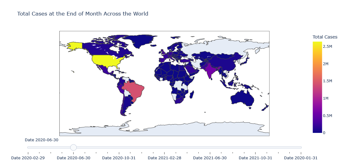
If I have to explain the above code, we have created a data for each of slider point and in our case a slider's single point is end of the month.
- Loop through unique date.
- Mask the data to get data of current date.
- Make a dictionary by giving common and essential values required to make a
chloropeth. - Give locations as
iso_code. - Give z axis as total cases.
- And use total cases on color bar title.
- Add this data to slider.
- For each date step, prepare a label.
- Update sliders and layout then make figure and plot it using iplot.
Density Mapbox
Another useful plot is density map box where we will plot density plot on the map. But we need longitude and latitude for that. And I have prepared it in GitHub already. Please find it on below link:
country_df = pd.read_csv("https://github.com/q-viper/State-Location-Coordinates/raw/main/world_country.csv")
country_df = country_df[["country", "lon", "lat", "iso_con"]]
tldf["country"] = tldf.location
tldf = tldf.merge(country_df[["country", "lat", "lon"]], on="country")tldf.head()| location | iso_code | date | total_cases | country | lat_x | lon_x | lat_y | lon_y | |
|---|---|---|---|---|---|---|---|---|---|
| 0 | Afghanistan | AFG | 2020-02-29 | 5.0 | Afghanistan | 33.768006 | 66.238514 | 33.768006 | 66.238514 |
| 1 | Afghanistan | AFG | 2020-03-31 | 166.0 | Afghanistan | 33.768006 | 66.238514 | 33.768006 | 66.238514 |
| 2 | Afghanistan | AFG | 2020-04-30 | 1827.0 | Afghanistan | 33.768006 | 66.238514 | 33.768006 | 66.238514 |
| 3 | Afghanistan | AFG | 2020-05-31 | 15180.0 | Afghanistan | 33.768006 | 66.238514 | 33.768006 | 66.238514 |
| 4 | Afghanistan | AFG | 2020-06-30 | 31445.0 | Afghanistan | 33.768006 | 66.238514 | 33.768006 | 66.238514 |
import plotly.express as px

fig = px.density_mapbox(tldf.drop_duplicates(keep="last"),
                          lat = tldf["lat"],
                          lon = tldf["lon"],
                          hover_name="location",
                          hover_data=["total_cases"],
                          color_continuous_scale="Portland",
                          radius=7,
                          zoom=0,
                          height=700,
                          z="total_cases"
                          )
fig.update_layout(title=f'Country vs total_cases',
                  font=dict(family="Courier New, monospace",
                            size=18,
                            color="#7f7f7f")
                )
fig.update_layout(mapbox_style="open-street-map", mapbox_center_lon=0)

fig.show()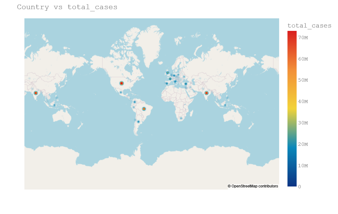
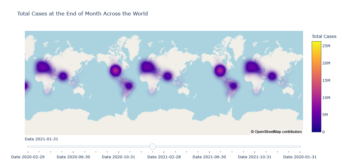
Density map plot is useful and clear when we are ploting onto state or city because it will make our plot little bit visible. Here it is not clearly visible.
Density Mapbox with Slider
first_day = tldf.date.min()

scl = [[0.0, '#ffffff'],[0.2, '#b4a8ce'],[0.4, '#8573a9'],
       [0.6, '#7159a3'],[0.8, '#5732a1'],[1.0, '#2c0579']] # purples

data_slider = []
for date in tldf['date'].unique():
    df_segmented =  tldf[(tldf['date']== date)]

    for col in df_segmented.columns:
        df_segmented[col] = df_segmented[col].astype(str)

    data_each_yr = dict(
                        type='densitymapbox',
                        lat = df_segmented["lat"],
                        lon = df_segmented["lon"],
                        hoverinfo="text",
                        # name = "country",
                        text = df_segmented["country"],
                        z=df_segmented["total_cases"].astype(float),
                        colorbar= {'title':'Total Cases'}
                        )

    data_slider.append(data_each_yr)

steps = []
for i,date in enumerate(tldf.date.unique()):
    step = dict(method='restyle',
                args=['visible', [False] * len(data_slider)],
                label='Date {}'.format(date))
    step['args'][1][i] = True
    steps.append(step)

sliders = [dict(active=0, pad={"t": 1}, steps=steps)]

layout = dict(mapbox_style="open-street-map",
              title ='Total Cases at the End of Month Across the World',
              sliders=sliders)

fig = dict(data=data_slider, layout=layout)

iplot(fig)